 | Cascading Style Sheets: The Definitive Guide |  |

Since most of the examples and figures in the chapter (besides the previous section) have been examples of absolute positioning, we're already halfway to an understanding of how it works. Most of what remain are the details of what happens when absolute positioning is invoked.
When an element is positioned absolutely, it is completely removed from the document flow. It is then positioned with respect to its containing block, and its edges are placed using the side-offset properties. The positioned element does not flow around the content of other elements, nor does their content flow around the positioned element. This implies that an absolutely positioned element may overlap other elements, or be overlapped by them. (We'll see how you can affect the overlapping order at the end of the chapter.)
Remember that the containing block of an absolutely positioned element is not necessarily its parent element. In fact, it often is not, unless the author takes steps to correct this situation. Fortunately, that's easy to do. Just pick the element that you want to use as the containing block for the absolutely positioned element, and give it a position of relative with no offsets. Thus:
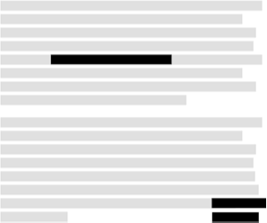
P.contain {position: relative;}Consider the example in Figure 9-19. It shows two paragraphs that contain identical text. However, the first paragraph contains an inline boldface element, and the second an absolutely positioned boldface element. In the second paragraph, the styles used would be something like what is shown here:
P {position: relative;}   /* establish containing blocks */

<B STYLE="position: absolute; top: auto; right: 0; bottom: 0; left: auto;
 width: 8em; height: 4em;">...</B>
For the most part, the text in both paragraphs looks fairly normal. In the second one, however, the place where the boldface element would have appeared is simply closed up, and the positioned text overlaps the some of the content. There is no way to avoid this, short of positioning the boldfaced text outside of the paragraph (by using a negative value for right) or by specifying a padding for the paragraph that is wide enough to accommodate the positioned element. Also, since it has a transparent background, the parent element's text shows through the positioned element. The only way to avoid this is to set a background for the positioned element.
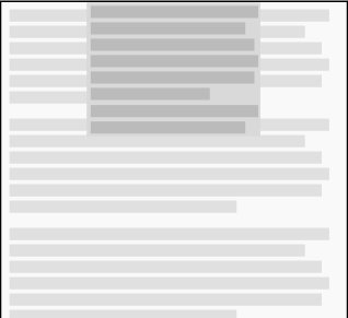
Note that the boldface element in this case is positioned in relation to its parent element's content box, which defines its containing block. Without the relative positioning of the parent element, the containing block would be another element. Consider a case where the element being positioned is a child of the BODY element, e.g., a paragraph or heading element. With the right styles, the containing block for the positioned element will be the entire BODY element. Thus, applying the following styles to the BODY and the fifth paragraph in a document would lead to a situation similar to that shown in Figure 9-20:
BODY {position: relative;}

<P STYLE="position: absolute; top: 0; right: 25%; left: 25%; bottom: auto;
 width: 50%; height: auto; background: silver;">...</P>
The paragraph is now positioned at the very beginning of the document, half as wide as the document's width and overwriting the first few elements!
In addition, if the document is scrolled, the paragraph will scroll right along with it. This is because the element's containing block is the BODY element's content area, not the viewport. If you want to position elements so that they're placed relative to the viewport and don't scroll along with the rest of the document, then the next section is for you.
Before we get there, however, there are a few more things to cover. Remember that absolutely positioned boxes can have backgrounds, margins, borders, and padding; styles can be applied within them, just as with any other element. This can make them very useful for the creation of sidebars, "sticky notes," and other such effects. One example is the ability to set a "change marker" on any paragraph that has been edited. This could be done using the following styles and markup:
SPAN.change {position: absolute; top: 0; left: -5em; width: 4em;
  font-weight: bold;}
P {margin-left: 5em; position: relative;}

<P> Lorem ipsum, dolor sit amet, consectetuer adipiscing elit,
sed diam nonummy nibh euismod tincidunt ut <SPAN CLASS="change">***</SPAN>
laoreet dolore magna aliquam erat volutpat.</P>
While this does rely on inserting an extra element, the advantage is that the SPAN can be placed anywhere in the paragraph and still have the result depicted in Figure 9-21.

However, maybe we'd like to place the change marker next to whatever line was changed. In that case, we need to make only one small alteration to our styles, and we'll get the result shown in Figure 9-22:
SPAN.change {position: absolute; top: static-position; left: -5em; width: 4em;
  font-weight: bold;}
P {margin-left: 5em; position: relative;}

<P> Lorem ipsum, dolor sit amet, consectetuer adipiscing elit,
sed diam nonummy nibh euismod tincidunt ut <SPAN CLASS="change">***</SPAN>
laoreet dolore magna aliquam erat volutpat.</P>
Remember when we mentioned static-position much earlier in the chapter? Here's one example of how it works and how it can be very useful.
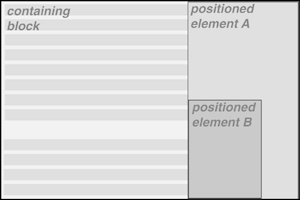
Another important point is that when an element is positioned, it establishes a containing block for its descendant elements. For example, we could absolutely position an element and then absolutely position one of its children, as shown in Figure 9-23.

The small box B in the lower-left corner of the element A is a child of A, which is in turn a child of a relatively positioned DIV. B was absolutely positioned, as was element A, using styles like these:
DIV {position: relative;}
P.A {position: absolute; top: 0; right: 0; width: 15em; height: auto;
   margin-left: auto;}
P.B {position: absolute; bottom: 0; left: 0; width: 10em; height: 50%;
   margin-top: auto;}
This is an important point to always keep in mind: only positioned elements establish containing blocks for their descendant elements. I know this has come up before, but it's so fundamental that it needs to be repeated.

Copyright © 2002 O'Reilly & Associates. All rights reserved.