 | Cascading Style Sheets: The Definitive Guide |  |

The simplest of the positioning schemes to understand is relative positioning. In this scheme, a positioned element is shifted by use of the side-offset properties. However, this can have some interesting consequences.
On the surface, it seems simple enough. Let's say we want to shift an image up and to the left. Figure 9-15 shows us the result of these styles:
IMG {position: relative; top: -20px; left: -20px;}
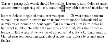
All we've done here is offset the image's top edge 20 pixels upward and offset the left edge 20 pixels to the left. However, notice the blank space where the image was previously positioned. That space exists because when an element is relatively positioned, it's shifted from its normal place, but the space it would have occupied doesn't disappear. Consider the results of the following styles, which are depicted in Figure 9-16:
EM {position: relative; top: 8em; color: gray;}
As you can see, the paragraph has some blank space in it. That's where the EM element would have been, and the layout of the EM element in its new position exactly mirrors the space it left behind.
This works because the containing block of a relatively positioned element is the space that it would have occupied had its position been static. This is an important thing to note, since one might expect that the containing block was defined by the parent element. Instead, the relatively positioned element sets its own containing block, and then offsets itself relative to that context.
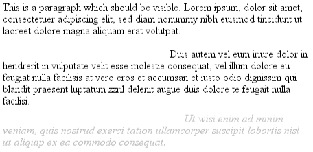
Of course, it's also possible that you can shift a relatively positioned element to overlap other content. For example, the following styles and markup will get you Figure 9-17:
EM {position: relative; bottom: -0.5em; color: gray;}
B {position: relative; bottom: 0.5em; color: gray;}

<P>This is a paragraph which should be visible. Lorem ipsum, dolor sit amet,
consectetuer adipiscing elit, sed diam nonummy nibh euismod tincidunt ut
laoreet dolore magna aliquam erat volutpat.
<EM>Ut wisi enim ad minim veniam, quis nostrud exerci tation ullamcorper
suscipit lobortis nisl ut aliquip ex ea commodo consequat.</EM>
Duis autem vel eum iriure dolor in hendrerit in vulputate velit esse
molestie consequat, vel illum dolore eu feugiat nulla <B>facilisis at vero
eros et accumsan et iusto odio dignissim qui blandit praesent luptatum</B>
zzril delenit augue duis dolore te feugait nulla facilisi.</P>
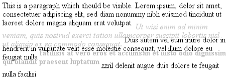
When you relatively position an element, it immediately establishes a new containing block for any of its children. This containing block corresponds to the place where the element has been positioned. Thus, you can position an element relative to its parent element, which has itself been relatively positioned. Figure 9-18 shows us the results of the following styles and markup:
P {color: gray;}
EM {position: relative; bottom: -0.75em; color: black;}
B {position: relative; bottom: 0.5em; left: 1em; color: black;}

<P>This is a paragraph which should be visible. Lorem ipsum, dolor sit amet,
consectetuer adipiscing elit, sed diam nonummy nibh euismod tincidunt ut
laoreet dolore magna aliquam erat volutpat.
<EM>Ut wisi enim ad minim veniam, <B>quis nostrud exerci tation ullamcorper
</B> suscipit lobortis nisl ut aliquip ex ea commodo consequat.</EM>
Duis autem vel eum iriure dolor in hendrerit in vulputate velit esse
molestie consequat, vel illum dolore eu feugiat nulla facilisis at vero eros
et accumsan et iusto odio dignissim qui blandit praesent luptatum zzril
delenit augue duis dolore te feugait nulla facilisi.</P>
The emphasized text has been shifted down 0.75 em from where it would have ordinarily appeared, which is to be expected. The boldface text has been moved 1 em to the right and upward half an em, but it is moved relative to the position of the emphasized text after it has been moved.
There is one interesting wrinkle to relative positioning: what happens when a relatively positioned element is overconstrained? For example:
EM {position: relative; top: 1em; bottom: 2em;}Here we have values that call for two very different behaviors. If you only consider top: 1em , then the element should be shifted downward an em, but bottom: 2em clearly calls for the element to be shifted upward by 2 ems.
The original CSS2 specification does not say what should happen in this case. As of this writing, there is a published errata that states that when it comes to overconstrained relative positioning, one value would be reset to be the negative of the other. Thus, bottom would always equal -top and right would equal -left. This means that the previous example would be treated as though it had been this:
EM {position: relative; top: 1em; bottom: -1em;}Thus the element will be shifted downward by 1 em. This proposed change also makes allowances for writing directions. It states that in relative positioning, right always equals -left in left-to-right languages, but in right-to-left languages, this is reversed: left would always equal -right.

Copyright © 2002 O'Reilly & Associates. All rights reserved.