 | Cascading Style Sheets: The Definitive Guide |  |

As implied in the previous section, fixed positioning is just like absolute positioning, except the containing block of a fixed element is always the viewport. In this case, the element is totally removed from the document's flow and does not have a position relative to any part of the document.
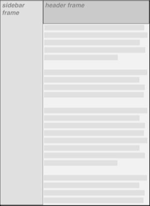
This can be exploited in a number of interesting ways. First off, it's possible to create frame-style interfaces using fixed positioning. Consider Figure 9-24, which shows a very common layout scheme.

This could be done using the following styles:
DIV#header {position: fixed; top: 0; bottom: 80%; left: 20%; right: 0;
  background: gray;}
DIV#sidebar {position: fixed; top: 0; bottom: 0; left: 0; right: 80%;
  background: silver;}
This will fix the header and sidebar to the top and side of the viewport, where they will remain regardless of how the document is scrolled. The drawback here, though, is that the rest of the document will be overlapped by the fixed elements. Therefore, the rest of the content should probably be contained in its own DIV and employ the following:
DIV#main {position: absolute; top: 20%; bottom: 0; left: 20%; right: 0;
  overflow: scroll; background: white;}
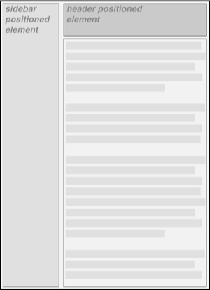
It would even be possible to create small gaps between the three positioned DIVs by adding some appropriate margins, demonstrated in Figure 9-25:
BODY {background: black; color: silver;}  /* colors for safety's sake */
DIV#header {position: fixed; top: 0; bottom: 80%; left: 20%; right: 0;
  background: gray; margin-bottom: 2px; color: yellow;}
DIV#sidebar {position: fixed; top: 0; bottom: 0; left: 0; right: 80%;
  background: silver; margin-right: 2px; color: maroon;}
DIV#main {position: absolute; top: 20%; bottom: 0; left: 20%; right: 0;
  overflow: scroll; background: white; color: black;}
Given such a case, a tiled image could be applied to the BODY background. This image would show through the gaps created by the margins, which could certainly be widened if the author saw fit. For that matter, if a background image was of little importance, simple borders could be applied to the DIVs instead of margins.

Copyright © 2002 O'Reilly & Associates. All rights reserved.