 | Cascading Style Sheets: The Definitive Guide |  |

While your web design efforts may be largely focused on picking the right colors and getting the coolest look for your pages, when it comes right down to it, you'll probably spend most of your time worrying about where text will go and how it will look. This concern gave rise to HTML tags such as <FONT> and <CENTER>, which give you some measure of control over the appearance and placement of text.
Because of this fact, much of CSS is concerned with properties that affect text in one way or another. In CSS1, the properties are split up into two sections: "Text Properties" and "Font Properties." This chapter is devoted to explaining the former. We'll tackle fonts in Chapter 5, "Fonts" -- they're quite complicated in their own way and so deserve a chapter all their own.
You may well wonder what the difference is between text and fonts. Simply put, text is the content. The font used to display it is just one more way of altering the appearance of the text. Before we get into fonts, though, there are some simpler ways to affect the appearance of your text. Besides, some of the things we discuss here will be important when we discuss the font properties, so it makes more sense to discuss the text properties first.
With the text properties, you can affect the position of text in relation to the rest of the line, and do things like superscripting, underlining, and changing the capitalization. You can even simulate, to a limited degree, the use of the Tab key on a typewriter.
It's best to start with a discussion of how you can affect the horizontal positioning of text within a line. This is not the same as actual positioning, which is done with respect to the page itself. Think of these properties as ways to affect how the lines of text are laid out, as you might do when creating a newsletter or writing a report.
One of the most sought-after effects in text formatting on the Web is the ability to indent the first line of a paragraph. (Close behind that is the desire to eliminate the "blank line" between paragraphs, which is discussed in Chapter 7, "Boxes and Borders"). Some sites solve this by placing a small transparent image before the first letter in a paragraph, thus shoving the text over, and others use the utterly nonstandard SPACER tag to get a similar effect. There is a better way, thanks to CSS.
text-indent
- Values
<length> | <percentage>
- Initial value
0
- Inherited
yes
- Applies to
block-level elements
WARNING
Percentage values refer to parent element's width.
Using text-indent, any element can have its first line indented by a given length -- even if that length is negative. The most common use for this property, of course, is to indent the first line of paragraphs:
P {text-indent: 0.25in;}This rule will cause the first line of any paragraph to be indented a quarter-inch, as shown in Figure 4-1.

In general, text-indent can be applied to any block-level element, such as PRE, H1, or BLOCKQUOTE. You can't apply it to inline elements, such as STRONG or A, nor can you use it on replaced elements such as images -- which makes sense, of course. However, if you have an image within the first line of a block-level element like a paragraph, it will be shifted over with the rest of the text, as shown in Figure 4-2.

It's possible to set negative values for text-indent, which can be used in a number of interesting ways. The most common is known as a "hanging indent," where the first line hangs out to the left of the rest of the element, as shown in Figure 4-3:
P {text-indent: -4em;}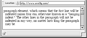
As you can see in Figure 4-3, there is an inherent danger in setting a negative value for text-indent: the first three words ("This is a") have been chopped off by the left edge of the browser window. In order to avoid such display problems, it is generally advisable to use a margin or some padding that will accommodate the negative indentation, as shown in Figure 4-4:
P {text-indent: -4em; padding-left: 4em;}Negative indents can occasionally be used to one's advantage. Consider the following example, demonstrated in Figure 4-5, which adds a floated image to the mix:
P.hang {text-indent: -30px;}

<P CLASS="hang"><IMG SRC="floater.gif" WIDTH="30px" HEIGHT="60px"
ALIGN="left" ALT="Floated">This paragraph has a negatively indented first
line, which overlaps the floated image which precedes the text.  Subsequent
lines do not overlap the image, since they are not indented in any way.</P>

Many interesting designs can be achieved using this simple technique. Figure 4-6 shows one example, where the first line of text has been indented -40px.
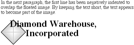
Any unit of length may be used with text-indent. In addition, percentage values are allowed. In this case, the percentage refers to the width of the parent element being indented. Thus, if you set the indent value to 5%, the first line of an affected element will be indented by 5% of the parent element's width, as shown in Figure 4-7:
DIV {width: 400px;}
P {text-indent: 5%;}

<P>This paragraph is contained inside a DIV which is 400px wide, so the
first line of the paragraph is indented 20px (400 * 5% = 20).  This is because
percentages are computed with respect to the width of the parent element.</P>
Note that this indentation will only apply to the first line of an element, even if you insert line breaks. Thus, as Figure 4-8 shows:
DIV {width: 400px;}
P {text-indent: 5%;}

<DIV>
<P>This paragraph is contained inside a DIV which is 400px wide, so the
first line of the paragraph is indented 20px (400 * 5% = 20).  Subsequent
lines within the same element are not indented,<BR>
even if they follow a<BR>
line-break.</P>
<P>Once again, the first line of this paragraph is indented by 20px,
but other lines in the same element are not.</P>
</DIV>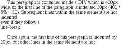
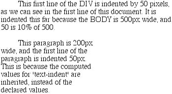
The interesting part about text-indent is that it's inherited, but what's inherited is the computed value, not the declared value. Take the following markup:
BODY {width: 500px;}
DIV {width: 500px; text-indent: 10%;}
P {width: 200px;}

<DIV>
This first line of the DIV is indented by 50 pixels.
<P>This paragraph is 200px wide, and the first line of the paragraph
is indented 50px.  This is because computed values for 'text-indent'
are inherited, instead of the declared values.</P>
</DIV>
Even though the paragraph is only 200 pixels wide, its first line is indented by 50 pixels (as Figure 4-9 shows), which is the inherited value for text-indent.
Even more basic than text-indent is the property text-align, which affects how lines of text in an element are aligned with respect to one another. There are four values; the first three are pretty simple, but the fourth has a few complexities.
text-align
- Values
left | center | right | justify
- Initial value
UA specific
- Inherited
yes
- Applies to
block-level elements
The fastest way to understand how these values work is to examine Figure 4-10.
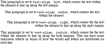
text-align is another property that only applies to block-level elements such as paragraphs. It isn't possible to center an anchor within its line without aligning the rest of the line (nor would you really want to).
The rule text-align: center can be used to replace the operation of the CENTER tag, as shown in Figure 4-11:
H1 {text-align: center;}
You can also cause the centering of elements that have both text and images within them -- again, it will act just like the CENTER tag, as Figure 4-12 and the following markup show:
DIV.first {text-align: center;}

<H1>An Un-centered H1 Element</H1>
<DIV CLASS="first">
<P>
This is a paragraph without any alignment styles applied to it.  However, it is
contained within a DIV element which has alignment set, and this alignment will
inherit into the paragraph.  This will also affect any images which appear within
the DIV, such as this one <IMG SRC="star.gif"> or the next one.
</P>
<IMG SRC="floater.gif">
</DIV>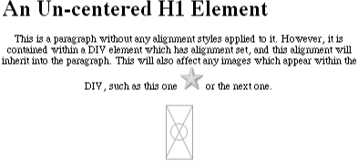
However, if you want to center an image all by itself, text-align is not the correct way to go about it. Given the following markup, you'll get the result in Figure 4-13:
IMG {text-align: center;}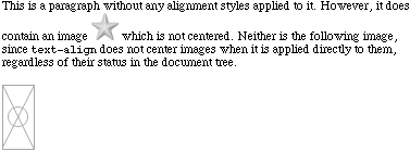
The basic reason the image isn't centered is that it isn't a block-level element. The only way to center an image using text-align is to wrap a DIV around the image, and set the DIV 's contents to be centered:
<DIV STYLE="text-align: center;">
   <IMG SRC="shiny.gif" ALT="Shiny object">
</DIV>
As Figure 4-14 shows, this will center the image.

For Western languages, which are read from left to right, the default value of text-align will be left, with text lining up on the left margin and having a ragged right margin (otherwise known as "left-to-right" text). Other languages, such as Hebrew and Arabic, will default to right instead, since these languages are written right-to-left. center has the expected effect, in that it causes each line of text to be centered within the element.
As for justify, there are a few issues to consider. As Figure 4-15 shows, justified text is formatted such that the ends of each line of text are placed at the inner edge of the parent element. This is accomplished by changing the spacing between words and letters so that each line is precisely the same length. This is an effect common to the print world (such as in this book), but under CSS, some extra considerations come into play.
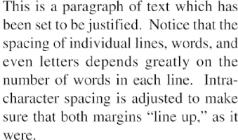
CSS does not specify how justified text should be "stretched out" to fill the space between the left and right edges of the parent, so some user agents might add extra space only between words, while others might distribute the extra space between letters. It's also possible that some user agents will reduce space on some lines, thus shmushing text together a bit more than usual. All of these various choices will affect the appearance of an element, and possibly even change its height, depending on how many lines result from the justification choices the user agent makes (see Figure 4-16).
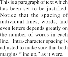
Another problem is that CSS doesn't say anything about how hyphenation should be handled. Most justified text uses hyphenation to break long words across two lines, thus reducing the space between words and improving the appearance of lines (see Figure 4-17).

TIP
The fact that hyphenation is not described in CSS has more to do with the fact that different languages have different hyphenation rules. Rather than try to concoct a set of rules that would most likely be incomplete, the specification simply avoids the problem. In addition, this allows user agents to employ their own hyphenation rules, and improve them over time without being hindered by anything in the CSS specification.
Since there is no hyphenation in CSS, user agents are unlikely to be able to perform any automatic hyphenation. Thus, justified text will very likely be less attractive under CSS than it might be in print, especially when elements become so narrow that only a few words can fit on each line, as shown in Figure 4-18. You can still justify text, of course, but be aware of the drawbacks.

WARNING
While almost every browser that supports CSS will handle most values of text-align, they often fall down when handling justify. Navigator 4 does support justify, but it's fairly buggy -- it most often breaks down within tables. Internet Explorer 4.x does not support justify, while IE5 does, and Opera 3.6 supports it as well.
For a change of pace, let's talk about the property white-space, which can greatly impact how text is actually displayed.
pre | nowrap | normal
normal
no
block-level elements
Using this property, you can affect how browser treats the whitespace between words and lines of text. To a certain extent, HTML already does this: it collapses any whitespace down to a single space. Thus, the following markup would be rendered as shown in Figure 4-19, with only one space between each word:
<P>This    paragraph   has     many
spaces in it.</P>You can explicitly set this behavior with the following declaration:
P {white-space: normal;}This rule will tell the browser that it should do as browsers have always done, and discard extra whitespace. Any extra spaces and carriage returns are completely ignored by the browser.
Should you set white-space to pre, however, the whitespace in affected elements will be treated as though the elements were PRE elements, in that whitespace would not be ignored, as shown in Figure 4-20:
P {white-space: pre;}

<P>This    paragraph   has     many
spaces in it.</P>With a white-space value of pre, the browser will pay attention to extra spaces and even carriage returns. In this respect, and in this respect alone, any element can be made to act like a PRE element.
On the other side of the coin is nowrap, which prevents text from wrapping within a block-level element, except through the use of <BR> elements. This is rather similar to setting a table cell not to wrap through <TD NOWRAP>, except that white-space value can be applied to any block-level element. Thus you can get effects as shown in Figure 4-21:
<P STYLE="white-space: nowrap;">This paragraph is not allowed to wrap,
which means that the only way to end a line is to insert a line-break
element.  If no such element is inserted, then the line will go forever,
forcing the user to scroll horizontally to read whatever can't be
initially displayed <BR>in the browser window.</P>
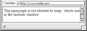
In fact, you can use white-space to replace the nowrap attribute on table cells, as demonstrated in Figure 4-22:
TD {white-space: nowrap;}

<TABLE><TR>
<TD>The contents of this cell are not wrapped.</TD>
<TD>Neither are the contents of this cell.</TD>
<TD>Nor this one, or any after it, or any other cell in this table.</TD>
<TD>CSS prevents any wrapping from happening.</TD>
</TR></TABLE>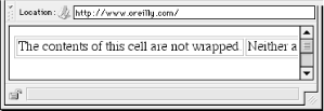
WARNING
Although white-space may seem like an insanely useful property, as of this writing, it isn't supported by anything except IE5 for Macintosh and preview builds of Netscape 6. Not even the ability to use nowrap for table cells is available in other browsers, despite the fact that it would seem to be a very simple behavior to support.
As opposed to the size of a font, which will be discussed in Chapter 5, "Fonts", line-height refers to the distance between the baselines of lines of text -- sort of. In fact, this property determines the amount by which the height of each element's line box is increased or decreased. In the simplest cases, it's a way of increasing (or decreasing) the vertical space between lines of text, but this is a misleadingly simple way of looking at how line-height works. If you're familiar with desktop publishing packages, then line-height controls the leading, which is the extra space between lines of text above and beyond the font's size. The difference between the value of line-height and the size of the font is the leading.
line-height
- Values
<length> | <percentage> | <number> | normal
- Initial value
normal
- Inherited
yes
- Applies to
all elements
WARNING
Percentage values are relative to the font size of the element.
In technical terms, every element in a line generates a content area, which is determined by the size of the font. This content area also generates an inline box which is, in the absence of any other factors, exactly equal to the content area. However, the leading generated by line-height can increase or decrease the height of the inline box. This is done by dividing the leading in half and applying each half-leading to the top and bottom of the content area. The result is the inline box. For example, if the content area is 14 points tall, and the line-height is set to 18 points, then the difference (4 points) is divided in half, and each half applied to the top and bottom of the inline box to arrive at an inline box which is 18 points tall. This sounds like a roundabout way to describe how line height works, but rest assured that there are excellent reasons for the description. See Chapter 8, "Visual Formatting", for a detailed explanation of the inline formatting model.
If you use the default value of normal, the amount of vertical space between lines will be the user agent's default. This is generally somewhere between 1.0 and 1.2 times the size of the font, but this can vary by user agent.
Allowed lengths other than em and ex are simple length measures (e.g., 0.125in). The usual caveats apply here; even if you use a valid length measure like 4cm , the browser (or the operating system) may have an incorrect metric for real-world measures. Thus, when you display your document on a monitor, a ruler might reveal that the line height was not exactly four centimeters. For more details, see Chapter 3, "Units and Values".
Percentages, as well as em and ex, are calculated with respect to the element's font-size. Thus, this markup is relatively straightforward, as Figure 4-23 shows:
BODY {line-height: 14pt; font-size: 13pt;}
P.one {line-height: 1.2em;}
P.two {font-size: 10pt; line-height: 150%;}
P.three {line-height: 0.33in;}

<P>This paragraph inherits a 'line-height' of 14pt from the BODY, as well as
a 'font-size' of 13pt.</P>
<P CLASS="one">This paragraph has a 'line-height' of 16.8pt (14 * 1.2), so
it will have slightly more line-height than usual.</P>
<P CLASS="two">This paragraph has a 'line-height' of 15pt (10 * 150%), so
it will have slightly more line-height than usual.</P>
<P CLASS="three">This paragraph has a 'line-height' of 0.33in, so it will have
slightly more line-height than usual.</P>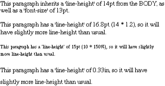
However, things get less predictable once the line-height is inherited from one block-level element to another. The computed line-height values are inherited no matter what font-size might be set for a child element. This can be something of a problem, as you can see in Figure 4-24:
BODY {font-size: 10pt;}
DIV {line-height: 12pt;}
P {font-size: 18pt;}

<DIV>
<P>This paragraph's 'font-size' is 18pt, but the inherited 'line-height'
is only 12pt.  This may cause the lines of text to overlap each other by
a small amount.</P>
</DIV>
There are two solutions. One is to set the line-height explicitly for every element, but this is not a very practical approach, given that you may have a number of elements that need such properties. The other possibility is to set a plain number instead, which actually sets a scaling factor:
BODY {font-size: 10pt;}
DIV {line-height: 1.5;}
P {font-size: 18pt;}
When a number is used, the scaling factor is inherited instead of a computed value. This factor is applied to the element and all of its child elements, so that each element has a line-height calculated with respect to its own font-size, as demonstrated in Figure 4-25:
BODY {font-size: 10pt;}
DIV {line-height: 1.5;}
P {font-size: 18pt;}

<DIV>
<P>This paragraph's 'font-size' is 18pt, and since the 'line-height'
set for the parent DIV is 1.5, the 'line-height' for this paragraph
is 27pt (18 * 1.5).</P>
</DIV>
As I said previously, although it seems like line-height distributes extra space both above and below each line of text, it actually adds (or subtracts) a certain amount from the top and bottom of an inline element. This leads to some odd cases when a line has elements with different font sizes, but for the moment, let's stick to a simple case. Assume that the default font-size of a paragraph is 12pt and consider the following:
P {line-height: 16pt;}Since the "inherent" line height of 12-point text is 12 points, the preceding rule means that there will be an extra 4 points of space around each line of text in the paragraph. This extra amount is divided in two, with half going above each line, and the other half below. While there is a distance of 16 points between the lines, this is an indirect result of how the extra space is apportioned.
Now let's look at a slightly more complex case. Take the following example:
BODY {font-size: 10pt;}
P {font-size: 18pt; line-height: 23pt;}
BIG {font-size: 250%;}

<P>This paragraph's 'font-size' is 18pt, and the 'line-height' for this
paragraph is 23pt. However, a <BIG>larger element</BIG> within the
paragraph does not cause the value of 'line-height' to change, which can
lead to some interesting effects.</P>
The result shown in Figure 4-26 may look like a browser bug, but it isn't. It's exactly how the example markup should be displayed.

This is by no means the only oddity which arises from using line-height. As backwards as it may seem, in Figure 4-27, the value of line-height is exactly the same for each and every line in the element, no matter how far apart they may actually appear to be. This fact will come up again in Section 4.1.3, "Vertical Alignment".

Again, the actual value for line-height in Figure 4-27 is the same for every line.
You can take advantage of the fact that line-height can be set for any element, including inline elements. Let's return to our previous example and make one small change by adding a line-height to the styles for the BIG element. We'll also change the line-height of the P element from 23pt to 27pt. This will have the result shown in Figure 4-28:
BODY {font-size: 10pt;}
P {font-size: 18pt; line-height: 27pt;}
BIG {font-size: 250%; line-height: 1em;}

<P>This paragraph's 'font-size' is 18pt, and the 'line-height' for this
paragraph is 27pt. A <BIG>larger element</BIG> within the paragraph does
not cause the line's height to change, but setting its 'line-height' does,
which leads to some interesting effects.</P>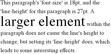
Setting a line-height of 1em for the BIG element will actually cause its line-height to be the same size as the BIG text itself. This has the same effect the images did: it opens up the entire line of text enough to clearly display the elements within it. In this case, the effect is due to the increased line-height of the inline element BIG, as opposed to the intrinsic size of an image, but the effect is largely the same.
The reasons why all of this happens are actually rather complex. For more details, please refer to the discussion of the inline formatting model found in Chapter 8, "Visual Formatting".
As we saw in the preceding section, a scaling factor is the best way to avoid the kinds of inheritance problems you encounter with length measures for line-height. It would therefore seem that using a number is always preferred. Alas, this is not necessarily so. Internet Explorer 3 will interpret a scaling factor as a pixel value, so you get something like what's shown in Figure 4-29.
According to the CSS specification, user agents are free to set whatever value they think best for the default keyword normal, but the suggested range is 1.0 to 1.2, depending on what works best for the display medium and the font in use. Most browsers seem to use something in the vicinity of 1.2, but of course that could change with a new browser, or even a new version of an old browser.
The odds are that you're already, to a certain extent, familiar with the concept of vertical alignment of text. If you've ever used the elements SUP and SUB (the superscript and subscript elements) or used an image with markup along the lines of <IMG SRC="foo.gif" ALIGN="texttop">, then you've done some rudimentary vertical alignment. The CSS property vertical-align permits all of the alignment you used to do on inline elements, and more besides.
WARNING
There is one thing to remember: vertical-align is not meant to affect the alignment of content in table cells, or within a block-level element. Under CSS1, there is no provision for duplicating markup such as <TD valign="top">. (This changes under CSS2; see Section 10.7, "Tables" in Chapter 10, "CSS2: A Look Ahead", for more details.)
So, let's see what can be done with vertical-align. This property applies only to inline elements, although that includes replaced elements such as images and form inputs, and it is not inherited.
vertical-align accepts any one of eight keywords, or a percentage value, but never both. The keywords are a mix of the familiar and unfamiliar: baseline (the default value), sub, super, bottom , text-bottom , middle, top, and text-top. We'll examine how each works in turn.
vertical-align: baseline forces an element to align its baseline with the baseline of its parent, which is pretty much what browsers already do anyway. For example, this markup results in Figure 4-30:
B {vertical-align: baseline;}

<P>The baseline of the <B>boldfaced text</B> is aligned with the baseline
of this paragraph.</P>In examining Fiture 4-30, you'll see that it doesn't look any different than you would expect. It shouldn't.
If a vertically aligned element doesn't have a baseline -- that is, if it's an image, a form input, or another replaced element -- then the bottom of the element is aligned with the baseline of its parent, as Figure 4-31 shows:
IMG {vertical-align: baseline;}

<P>The image found in this paragraph <IMG SRC="dot.gif" ALT="a dot"> has its
bottom edge aligned with the baseline of the paragraph.</P>The declaration vertical-align: sub causes the element to be " subscripted." In general, this means that the element's baseline (or bottom, if it's a replaced element) is lowered with respect to its parent's baseline. However, the distance it is lowered is not defined in the specification, so it may vary from one user agent to another. Note that sub does not imply a change in the element's font size, so it should not cause subscripted text to become smaller (or larger). Instead, any text in the subscripted element should be, by default, the same size as text in the parent element, as shown in Figure 4-32:
SUB {vertical-align: sub;}

<P>This paragraph contains <SUB>subscripted</SUB> text.</P>Of course, you could make the text smaller by using font-size, but you have to do it yourself.
super acts in a fashion similar to sub, but in this case, the element's baseline (or bottom of a replaced element) is raised with respect to the parent's baseline. Again, the distance the text will be raised is dependent on the user agent, and there is no implied change in the size of the font. This is demonstrated in Figure 4-33:
SUP {vertical-align: super;}

<P>This paragraph contains <SUP>superscripted</SUP> text.</P>vertical-align: bottom sounds pretty simple: it aligns the bottom of the element's inline box with the bottom of the line box. For example, this markup results in Figure 4-34:
IMG.feeder {vertical-align: bottom;}

<P>This paragraph contains an image <IMG SRC="tall.gif" ALIGN="middle"
ALT="tall image"> which is tall, and another image <IMG SRC="short.gif"
CLASS="feeder" ALT="short image"> which is not tall.</P>
As you can see from Figure 4-34, the second line of the paragraph contains two images, and their bottom edges are aligned with each other. (The first image has been set to a middle alignment using the HTML attribute align. We'll look into ways of achieving a similar effect with CSS a little later in this chapter.)
vertical-align: text-bottom refers to the bottom of the text in the line. Replaced elements, or indeed nontext elements of any kind, are ignored for the purposes of this value. Instead, a "default" text box is considered. This default box is derived from the font-size of the parent element. The bottom of the aligned element's inline box is then aligned with the bottom of default text box. Thus, given the following markup, we get a situation such as that shown in Figure 4-35:
IMG.tbot {vertical-align: text-bottom;}

<P>Here: a <IMG SRC="tall.gif" ALIGN="middle"
ALT="tall image"> tall image, and then a <IMG SRC="short.gif"
CLASS="tbot" ALT="short image"> short image.</P>
Employing vertical-align: top has pretty much the opposite effect of bottom . Likewise, vertical-align: text-top is the reverse of text-bottom . Figure 4-36 shows how the following markup would be rendered:
IMG.up {vertical-align: top;}
IMG.textup {vertical-align: text-top;}

<P>Here: a <IMG SRC="tall.gif" ALIGN="middle"
ALT="tall image"> tall image, and then a <IMG SRC="short.gif"
CLASS="up" ALT="short image"> short image.</P>
<P> Here: a <IMG SRC="tall.gif" CLASS="textup"
ALT="tall image"> tall image, and then a <IMG SRC="short.gif"
CLASS="textup" ALT="short image"> short image.</P>
Of course, the exact position of that alignment will depend on what elements are in the line and how tall they are.
Then there is vertical-align: middle. This value is usually applied to images, since it causes the vertical midpoint of the element to be aligned with the "middle" of the line. The middle of the line is defined to be the point which is one-half ex above the baseline, where the value of ex is derived from the font-size of the parent element. An example is shown in Figure 4-37:
IMG {vertical-align: middle;}
In practice, since most user agents treat 1ex as one-half em, middle will cause the vertical midpoint of an element to be aligned with a point one-quarter em above the parent's baseline. Figure 4-38 shows this in more detail.

This is pretty close to simulating <IMG ALIGN="middle">, as you can see, and you'd probably think that percentages would get even closer.
As it turns out, no, percentages don't let you simulate ALIGN="middle" for images. Instead, setting a percentage value for vertical-align causes the baseline (or bottom of a replaced element) of the element to be raised or lowered by the amount declared, with respect to the parent's baseline. The percentage you specify is calculated as a percentage of the value for line-height. Positive percentage values cause the element to be raised, and negative values cause it to be lowered. This can cause elements to be raised or lowered such that they appear to be placed in adjacent lines, as shown in Figure 4-39, so you should take care when using percentage values:
B {vertical-align: 100%;}

<P>This paragraph contains some <B>boldfaced</B> text, which is raised
up 100%.  This makes it look as though it's on a preceding line.</P>
However, it's important to realize that the vertically aligned text is not part of another line. It just appears that way when there isn't any other text around. Consider Figure 4-40, in which some vertically aligned text appears in the middle of a paragraph.

Of course, this sort of thing can lead to some fun visual effects, as we see in Figure 4-41:
SUB {vertical-align: -100%;}
SUP {vertical-align: 100%;}

<P>We can either <SUP>soar to new heights</SUP> or, instead,
<SUB>sink into despair...</SUB></P>
Since percentage values are meant to be percentages of the line-height, what happens when a particularly tall image within a line causes the line's apparent height to increase?
If you'll recall from before, the answer is that an image, no matter how tall it is, doesn't actually cause the line-height to increase. What is increased is the height of the line box. Therefore, if a line's height is 14px, and an element within that line is vertically aligned to 50%, and within that same line, there is an image 50 pixels tall, you get the result shown in Figure 4-42:
SUP {vertical-align: 50%;}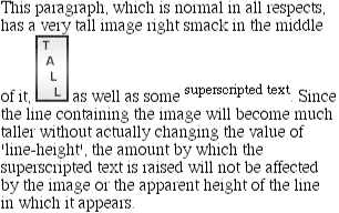
The 50%-aligned element has its baseline raised 7 pixels (which is half of 14px), not 25 pixels. Also note that the line-box has been made tall enough to accommodate the image. This is actually consistent with the inline box model, because replaced elements have this kind of effect.
We can see the operation of vertical alignment more clearly if we have two images, one of which is vertically aligned with a percentage value. The results, shown in Figure 4-43, are dependent on the line-height, which we'll explicitly declare to be 14px:
P {line-height: 14px;}
IMG.up {vertical-align: 50%;}

<P>Some <IMG SRC="tall.gif" alt="tall image">
<IMG SRC="short.gif" CLASS="up" ALT="short image"> text.</P>
The bottom (or baseline) of the smaller image is raised by one-half (50%) of the line-height, or 7 pixels. If we had set the alignment for IMG.up to be -50%, then the shorter image would have been lowered by 7 pixels.
As we've already seen, the way a given line of text is displayed will depend greatly on the vertical alignments of the various elements within that line. However, this fact deserves to be emphasized again, due to its importance. Assume, for example, that a line contains an image which has been middle-aligned, and an inline text element which has been bottom-aligned. This would result in the situation shown in Figure 4-44:
IMG {vertical-align: middle;}
SUB {vertical-align: bottom;}
If we change the text element so that it's text-bottom-aligned, though, the situation changes quite radically, as Figure 4-45 shows:
IMG {vertical-align: middle;}
SUB {vertical-align: text-bottom;}
The concepts here are fairly simple: word and letterspacing are ways of inserting or reducing space between either words or letters. As usual, though, there are some nonintuitive issues to consider with these properties; first, let's talk about the spaces between words.
|
The word-spacing property will accept a length that is either positive or negative. This value is added to the usual space between words, which perhaps isn't quite what you might expect. In effect, word-spacing is used as a modifier to interword spacing. Therefore, the default value of normal is the same as setting a value of zero (0), as shown in Figure 4-46:
P.base {word-spacing: normal;}
P.norm {word-spacing: 0;}
Therefore, if we supply a positive length value, then the space between words will increase, as demonstrated in Figure 4-47:
P {word-spacing: 0.2em;}

<P>The spaces between words in paragraphs will be increased by 0.2em.</P>By setting a negative value for word-spacing, words can be brought closer together. This has an effect like that shown in Figure 4-48:
P {word-spacing: -0.4em;}

<P>The spaces between words in paragraphs will be decreased by 0.4em.</P>So far, we've left out a precise definition of what a "word" really is. In the simplest CSS terms, a "word" is any string of non-whitespace characters that is surrounded by whitespace of some kind. This definition has no real semantic significance -- it is merely assumed that an author will write a document such that each word is surrounded by one or more whitespace characters. Obviously, a CSS-aware user agent cannot be expected to decide what is a valid word in a given language and what isn't.
This also means that any languages that employ pictographs, or other non-Roman writing styles, will probably not be able to take advantage of this property. Furthermore, this definition of "word" is not something user agents are required to follow; it merely represents the most basic way of defining a word. User agents may employ more sophisticated ways of deciding what a word is or isn't.
It is, of course, possible to create very unreadable documents with this property, as Figure 4-49 makes clear:
P {word-spacing: 1in;}
|
Many of the same issues with word-spacing return for letter-spacing. The only real difference between this property and word-spacing is that letter-spacing is a modifier of the usual amount of space between characters, or letters.
Once again, the permitted values are any length value and the default keyword normal (which is functionally the same as letter-spacing: 0 ). Any length value will increase or decrease the space between letters by the amount declared. Figure 4-50 shows the results of the following markup:
P {letter-spacing: 0;}    /*  identical to 'normal'  */
P.spacious {letter-spacing: 0.25em;}
P.tight {letter-spacing: -0.25em;}

<P>The letters in this paragraph are spaced as normal.</P>
<P CLASS="spacious">The letters in this paragraph are spread out a bit.</P>
<P CLASS="tight">The letters in this paragraph are smooshed together a bit.</P>
One interesting use for letter-spacing is to increase emphasis, which is a technique that was common in past centuries. Thus, you might declare the following to get an effect like that shown in Figure 4-51:
STRONG {letter-spacing: 0.2em;}

<P>This paragraph contains <STRONG>strongly emphasized text</STRONG>
which is spread out for extra emphasis.</P>Both word-spacing and letter-spacing can be influenced by the value of text-align. If an element is set to be justified, then the spaces between letters and words may be altered to permit full justification, which may in turn alter the spacing declared by the author with word-spacing or letter-spacing. The CSS specification does not specify how the spacing should be calculated in such a case, so user agents are free to do whatever their programmers thought best.
Furthermore, as usual, the computed value of an element is inherited by any child elements. Unlike line-height, there is no way to define a scaling factor for word-spacing or letter-spacing to be inherited in place of the computed value. Thus we have problems such as those shown in Figure 4-52:
P {letter-spacing: 0.25em;}
SMALL {font-size: 50%;}

<P>This spacious paragraph features <SMALL>tiny text which is just
as spacious</SMALL>, even though the author probably wanted the
spacing to be in proportion to the size of the text.</P>
The only way to get an effect where the letterspacing is in proportion to the size of the text is to set it explicitly, with the result shown in Figure 4-53:
P {letter-spacing: 0.25em;}
SMALL {font-size: 50%; letter-spacing: 0.25em;}

<P>This spacious paragraph features <SMALL>tiny text which is
proportionally spacious</SMALL>, which is what the author
probably wanted.</P>
Now we turn to ways to fiddle with the capitalization of text. This is done with the property text-transform .
|
The default value none will simply leave the text alone and use whatever capitalization exists in the source document. uppercase and lowercase cause the text to be converted into all upper- or lowercase characters, as their names would indicate. Finally, capitalize causes the first letter of each word to be capitalized and leaves the rest of the characters in each word alone. (Note that for the purposes of this property, a "word" is the same as discussed in the section on word-spacing.)
Figure 4-54 shows each of these settings in a variety of ways:
STRONG {text-transform: uppercase;}
H1, H2, H3 {text-transform: capitalize;}
P.cummings {text-transform: lowercase;}
P.raw {text-transform: none;}

<H1>The heading-one at the beginninG</H1>
<P>
By default, text is displayed in the capitalization it has in the source
document, but <STRONG>it is possible to change this</STRONG> using
the property 'text-transform'.
</P>
<P CLASS="cummings">
For example, one could Create TEXT such as might have been Written by
the late Poet E.E.Cummings.
</P>
<P CLASS="raw">
If you feel the need to Explicitly Declare the transformation of text,
that can be done as well.
</P>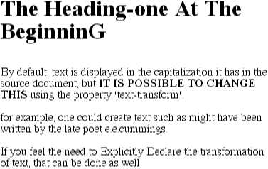
Note that different user agents may have different ways of deciding where words begin, and thus which letters should be capitalized. As an example, the text "heading-one" in the H1 element, shown in Figure 4-54, could be rendered in one of two ways: "Heading-one" or "Heading-One." CSS does not say which is correct, so either one is possible.
Also note that the last letter in the H1 element in Figure 4-54 is still in uppercase. This is correct: when applying a text-transform of capitalize, CSS only requires that user agents make sure that the first letter of each word is capitalized. They don't have to do anything to the rest of the word.
As a property, text-transform may not seem like it does very much. In fact, it's very useful if you suddenly decide that you want all of your H1 elements to be all capitals. Instead of having to actually change the content of all your H1 elements, you can just use text-transform to make the change for you:
H1 {text-transform: uppercase;}

<H1>This is an H1 element</H1>
As you can see from Figure 4-55, the text is now all capitals.
The advantages are twofold. First, all you have to do is write a single rule to make this change, rather than having to make changes to the H1 itself. Second, if you decide later to switch from all capitals to capitalizing the first letter of each word, the change is even easier, as Figure 4-56 shows: way.
H1 {text-transform: capitalize;}

<H1>This is an H1 element</H1>Finally, we come to text-decoration, which is a fascinating property that carries along a whole truckload of oddities and inconsistencies in browsers. First, however, let's talk about how it should work in theory.
|
As you might expect, underline causes an element to be underlined, just like the U element in HTML. overline is the flip side; a line is drawn across the top of the text in an overlined element. The value line-through draws a line straight through the middle of the text, which also known as "strikethrough" text and is equivalent to the S and STRIKE elements in HTML. And, of course, blink causes the text to blink on and off, just like the BLINK tag supported by Netscape. Figure 4-57 shows examples of each of these values:
P.emph {text-decoration: underline;}
P.topper {text-decoration: overline;}
P.old {text-decoration: line-through;}
P.annoy {text-decoration: blink;}
P.plain {text-decoration: none;}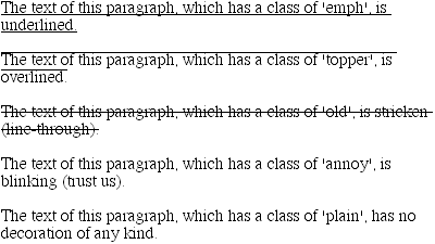
WARNING
It's impossible to show the effect of blink in print, of course, but it's easy enough to imagine. User agents are not required to support blink, incidentally, and only Navigator 4.x actually supports it as of this writing.
As the last part of Figure 4-57 shows, the value none turns off any decoration which might otherwise have been applied to an element. This is usually the default appearance for text, but not always. For example, links are usually underlined by default. If you wished to suppress the underlining of hyperlinks, a CSS rule to do so would be:
A:link {text-decoration: none;}The text in Figure 4-58 contains three hyperlinks: the three list items. Since we explicitly turned off link underlining, the only visual difference between the anchors and normal text is the color.

TIP
Although I personally don't have a problem with it, many users have a tendency to get violently annoyed when they realize you've turned off link underlining. Obviously, it's a matter of opinion, so let your own tastes be your guide -- but remember that if your link colors aren't sufficiently different from normal text, visually impaired users may have a really hard time finding hyperlinks in your documents.
It is also possible to combine decorations in a single rule. For example, assume that you wish to have all hyperlinks be both underlined and overlined. The needed rule for such an effect is:
A:link, A:visited {text-decoration: underline overline;}This effectively makes text-decoration a shorthand element. You have to be careful in this case, because if you have two different decorations matched to the same element, the value of the rule that wins out will completely replace the value of the loser. Consider:
H2.stricken {text-decoration: line-through;}
H2 {text-decoration: underline overline;}
Given these rules, any H2 element with a class of stricken will have only a line-through decoration. The underline and overline decorations are lost, since shorthand values replace one another, instead of accumulating.
Now, let's get into the many strange things about text-decoration. First off is the fact that text-decoration is not inherited. This implies a requirement that any decoration lines drawn with the text -- either under, over, or through it -- should be the same color as the parent element. This is the case even if the child elements are different colors, as depicted in Figure 4-59:
P {text-decoration: underline; color: black;}
B {color: gray;}

<P>This paragraph, which is black and has a black underline, also contains
<B>boldfaced text</B> which has the black underline beneath it as well.</P>Why is this so? Because the value of text-decoration is not inherited, the B element has a default value of none. Therefore, the B element has no underline. Of course, there is very clearly a line under the B element, so it seems silly to say that it has no underline. Still, it doesn't. What you see under the B element is the paragraph's underline, which is effectively "spanning" the B element. This can be made more explicit by altering the styles for the boldface element thus:
P {text-decoration: underline; color: black;}
B {color: gray; text-decoration: none;}

<P>This paragraph, which is black and has a black underline, also contains
<B>boldfaced text</B> which has the black underline beneath it as well.</P>
The result is the same, since all we've done is to explicitly declare what was already the case. In other words, there is no way to "turn off " underlining (or overlining or a line-through) within an element. If a decoration has been set for an element, then all of its children will have the decoration applied visually, if not in fact.
Combined with vertical-align, even stranger things will happen. Figure 4-60 shows but one of these oddities. Since the SUP element has no decoration of its own, but it is elevated within an overlined element, the overline cuts through the middle of the SUP element:
P {text-decoration: overline; font-size: 12pt;}
SUP {vertical-align: 50%; font-size: 12pt;}
By now, you may be despairing of ever using text decorations, thanks to all the problems they could cause. It gets worse, though (or maybe better), because so far we've been exploring the way things should work according to the specification. In reality, many web browsers do turn off underlining in child elements, even though they shouldn't really do so. The reason they violate the specification is simple enough: author expectations.
P {text-decoration: underline; color: black;}
B {color: gray; text-decoration: none;}

<P>This paragraph, which is black and has a black underline, also contains
<B>boldfaced text</B> which does not have black underline beneath it.</P>
As Figure 4-61 shows, a web browser switched off the underlining for the B element. Navigator, Explorer, and Opera all do this, if there is an explicit text-decoration: none to cause the suppression of underlining. This is, of course, what an author would tend to expect, and that's why the browsers do it.
The caveat here is that browsers (or any other user agents) might one day follow the specification precisely. If you depend on using none for the suppression of decorations, realize that it may come back to haunt you in the future. Then again, future versions of CSS could include a way to turn off decorations without using none in the wrong way, so maybe there's hope.
Finally, there is a way to change the color of a decoration without violating the specification. As you'll recall, setting a text decoration on an element means that the entire element should have the same color decoration, even if there are child elements of different colors. In order to match the decoration color with each element, you need to explicitly declare the decoration, as follows:
P {text-decoration: underline; color: black;}
B {color: gray; text-decoration: underline;}

<P>This paragraph, which is black and has a black underline, also contains
<B>boldfaced text</B> which has its own gray underline.</P>
In Figure 4-62, the B element is set to be gray and to have an underline. The gray underline "overwrites" the parent's black underline, and so the decoration's color matches the color of the B element.

Copyright © 2002 O'Reilly & Associates. All rights reserved.