 | HTML & XHTML: The Definitive Guide, 4th Edition |  |

Users have a hard enough time reading what's displayed on a screen. A long flow of text, unbroken by title, subtitles, and other headers, crosses the eyes and numbs the mind, not to mention the fact that it makes it nearly impossible to scan the text for a specific topic.
You should always break a flow of text into several smaller sections within one or more headings (like this book!). There are six levels of headings that you can use to structure a text flow into a more readable, more manageable document. And, as we discuss in Chapter 5, "Rules, Images, and Multimedia" and in Chapter 8, "Cascading Style Sheets", there are a variety of graphical and text-style tricks that help divide your document and make its contents more accessible as well as more readable to users.
The six heading tags, written as <h1>, <h2>, <h3>, <h4>, <h5>, and <h6>, indicate the highest (<h1>) to the lowest (<h6>) precedence a heading may have in the document.
<h1>, <h2>, <h3>, <h4>, <h5>, <h6>
- Function:
Define one of six levels of headers
- Attributes:
ALIGN
ONKEYUP
CLASS
ONMOUSEDOWN
DIR
ONMOUSEMOVE
ID
ONMOUSEOUT
LANG
ONMOUSEOVER
ONCLICK
ONMOUSEUP
ONDBLCLICK
STYLE
ONKEYDOWN
TITLE
ONKEYPRESS
- End tag:
</h1>, </h2>, </h3>, </h4>, </h5>, </h6>; never omitted
- Contains:
text
- Used in:
body_content
The enclosed text within a heading typically is uniquely rendered by the browser, depending upon the display technology available to it. The browser may choose to center, embolden, enlarge, italicize, underline, or change the color of headings to make each stand out within the document. And in order to thwart the most tedious writers, users, as well, often can alter how a browser will render the different headings.
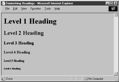
Fortunately, in practice most browsers use a diminishing character point size for the sequence of headers, so that <h1> text is quite large and <h6> text is quite minuscule (see Figure 4-3, for example).

By tradition, authors have come to use <h1> headers for document titles, <h2> headers for section titles, and so on, often matching the way many of us were taught to outline our work with heads, subheads, and sub-subheads.
Finally, don't forget to include the appropriate heading end tags in your document. The browser won't insert one automatically for you, and omitting the ending tag for a heading can have disastrous consequences for your document.
The default heading alignment for most browsers is left. Like the <div> and <p> tags, you can alter this alignment with the align attribute and one of the values left, center, right, or justify. Figure 4-4 shows these alternative alignments as rendered from the following source:
<h1 align=right>Right over here!</h1>
<h2 align=left>Slide back left.</h2>
<h3 align=center>Smack in the middle.</h3>

The justify value for align is not supported yet by any browser, and don't hold your breath. The align attribute is deprecated in HTML 4 and XHTML in deference to style sheet-based controls.
The dir attribute lets you advise the browser as to which direction the text within that paragraph ought to be displayed, and lang lets you specify the language used within the heading. Section 3.6.1.1, "The dir attribute" Section 3.6.1.2, "The lang attribute"
Use the id attribute to create a label for the heading that can later be to used to unambiguously reference that heading in a hyperlink target, for automated searches, as a style-sheet selector, and with a host of other applications. Section 4.1.1.4, "The id attribute"
Use the optional title attribute and quote-enclosed string value to provide a descriptive phrase for the heading. Section 4.1.1.5, "The title attribute"
Use the style attribute with the heading tags to create an inline style for the headings' contents. The class attribute lets you label the heading with a name that refers to a predefined class declared in some document-level or externally defined style sheet. Section 8.1.1, "Inline Styles: The style Attribute" Section 8.3, "Style Classes"
Each user-initiated event that may happen in and around a heading each are recognized by the browser if it conforms to the HTML or XHTML standards. With the respective "on" attribute and value, you may react to that event by displaying a user dialog box or activating some multimedia event. Section 12.3.3, "JavaScript Event Handlers"
It's good form to repeat your document's title in the first heading tag, since the title you specify at the beginning of your document doesn't appear in the user's main display window. The title should match the one in the document's <head>. The following HTML segment is a good example of repeating the document's title in the header and in the body of the document:
<html>
<head>
<title>Kumquat Farming in North America</title>
</head>
<body>
<h3>Kumquat Farming in North America</h3>
<p>
Perhaps one of the most enticing of all fruits is the...
While the browser may place the title somewhere in the document window and may also use it to create bookmarks or hotlist entries, all of which vaguely are somewhere on the user's desktop, the level three title heading in the example will always appear at the very beginning of the document. It serves as a visible title to the document regardless of how the browser handles the <title> tag contents. And, unlike the <title> text, the heading title will appear at the beginning of the first page should the user elect to print the document. Section 3.7.2, "The <title> Tag"
In the example, we chose to use a level three heading (<h3>) whose rendered font typically is just a bit larger than the regular document text. Levels one and two are larger still and often a bit overbearing. You should choose a level of heading that you find useful and attractive and use that level consistently throughout your documents.
Once you have established the top-level heading for your document, use additional headings at the same or lower level throughout to add structure and "scanability" to the document. If you use a level three heading for the document title, break your document into several sections using level four headings. If you have the urge to subdivide your text further, consider using a level two heading for the title, level three for the section dividers, and level four for the subsections.
For most graphical browsers, the fonts used to display <h1>, <h2>, and <h3> headers are larger, <h4> is the same, and <h5> and <h6> are smaller than the regular text size. Authors typically use the latter two sizes for boilerplate text, like a disclaimer or a copyright notice. It's become quite popular to use the smaller text in Tables of Contents or home pages that display a site's contents. Experiment with <h5> and <h6> to get the effect you want. See how a typical browser renders the copyright reference in the following sample HTML segment (see Figure 4-5):
resulting in years of successful kumquat production
throughout North America.
</p>
<h6>This document copyright 1995 by the Kumquat Growers of
America. All rights reserved. </h6>
</body>
</html>

A heading may contain any element allowed in text, including conventional text, link anchors (<a>), images (<img>), line breaks (<br>), font embellishments (<b>, <i>, <tt>, <u>, <strike>, <big>, <small>, <sup>, <sub>, and <font>), and content-based style changes (<acronym>, <cite>, <code>, <dfn>, <em>, <kbd>, <samp>, <strong>, and <var>). In practice, however, font or style changes may not take effect within a heading, since the heading itself prescribes a font change within the browser.
There is widespread abuse of the heading tags as a mechanism for changing the font of an entire document. Technically, paragraphs, lists, and other block elements are not allowed within a heading and may be mistaken by the browser to indicate the implied end of the heading. In practice, most browsers apply the style of the heading to all contained paragraphs. We discourage this practice since it is not only a violation of HTML and XHTML standards but usually ugly to look at. Imagine if your local paper printed all the copy in headline type!
Designating large sections of text as heading content defeats the purpose of the tag. If you really want to change the entire font or type size of your document, consider instead defining a unique style for the <body> tag of your document. This style will be applied to all the content within the <body> and will make later modification of your document style much easier. See Chapter 8, "Cascading Style Sheets" for details.
And we strongly recommend that you carefully test your pages with more than one browser and at several different resolutions. As to be expected, your <h6> text may be readable at 320 x 480 resolution, but disappear on a 600 x 800 display.
Formally, the HTML and XHTML standards allow headings only within body content. In practice, most browsers recognize headings almost anywhere, formatting the rendered text to fit within the current element. In all cases, the occurrence of a heading signifies the end of any preceding paragraph or other text element, so you can't use the heading tags to change font sizes in the same line. Rather, use styles to achieve those acute display effects. Section 8.1.1, "Inline Styles: The style Attribute"
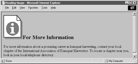
It is possible to insert one or more images within your headings, from small bullets or icons to full-sized logos. Combining a consistent set of headings with corresponding icons across a family of documents is not only visually attractive, but an effective way of aiding users' perusal of your document collection. Section 5.2.6, "The <img> Tag"
Adding an image to a heading is easy. For example, the following text puts an "information" icon inside the "For More Information" heading, as you can see in Figure 4-6:
<h2>
<img src="info.gif">
For More Information</h2>
In general, images within headings look best at the beginning of the heading, aligned with the bottom or middle of the heading text.


Copyright © 2002 O'Reilly & Associates. All rights reserved.