 | Web Design in a Nutshell, 2nd Edition |  |

Normal GIFs are either displayed one row of pixels at a time, from top to bottom, or all at once when the entire file has downloaded. On slow connections, this can mean potentially long waits with empty space and generic graphic icons on the screen.
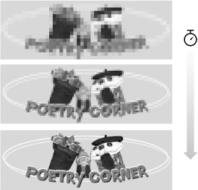
As an alternative, you can save a GIF87a or 89a with interlacing. An interlaced GIF is displayed in a series of four passes, with the first hint of the upcoming image appearing after only 1/8th (12.5%) of the file has downloaded. The first pass has the appearance of a blurry mosaic; as more data flows in, the blurred areas are filled in with real image information and the image becomes more defined (Figure 19-2). The three subsequent passes fill in 25%, 50%, and 100% of the image information, respectively.
Graphics programs that support the GIF format provide an interlacing option (usually a checkbox) in the Save as or Export dialog box. Simply turn the interlacing on or off when you save the GIF.

The advantage to using interlacing is that it quickly gives the viewer some idea of the graphic to come. This peek may be enough to make some important decisions. For instance, if the graphic is a familiar imagemap, the user can use the link to go to another page before the entire image has downloaded. In some cases, the partially downloaded image might be enough for the viewer to decide that she doesn't want to wait for the rest.
The main trade-off in choosing to make a GIF interlaced is that it slightly increases the file size of the resulting graphic. There are also aesthetic considerations involved that come down to a matter of personal taste. Some viewers would rather see nothing at all than look at the temporary visual chaos an interlaced GIF creates. For these reasons, you may choose to limit interlacing to instances when it makes sense, such as for large imagemaps, instead of using it for every small graphic on a page.

Copyright © 2002 O'Reilly & Associates. All rights reserved.