 | Web Design in a Nutshell, 2nd Edition |  |

In August of 1997, the W3C published its working draft of specifications for style sheet properties for positioning HTML elements on the page and in three-dimensional space. This greater control over object placement can be used for more tightly designed static page layout as well as for creating and tracking motion effects with DHTML.
This effort was initiated by Netscape and Microsoft, who began supporting some positioning properties in their Version 4.0 browsers. The positioning concepts and properties were picked up and developed further in the CSS Level 2 specification, which was released in May of 1998.
Style sheet positioning is a rich and complex topic that is beyond the scope of this chapter, but this section aims to introduce some basic positioning concepts. For complete positioning information, see the W3C's CSS2 specification online at http://www.w3.org/TR/REC-CSS2.
While the positioning properties are reviewed here, they come with a word of warning. Positioning is one of the most inconsistently implemented and buggy aspects of style sheets. It will be a while before a single solution works across all platforms and browsers in a predictable fashion. This is particularly unfortunate because positioning is a tempting feature and essential to some DHTML effects. If you use positioning in your pages, be sure to test thoroughly.
The position property has three possible values: absolute, relative, and static.
It works in conjunction with the top and left properties (used for specifying distances from the top and left starting point), the bottom and right properties, and the width and height properties (for specifying the width and height of the element, including its padding and border). Values for these properties can be specified as either length units or percentages.
Relative positioning places the element relative to its initial position in the flow (i.e., where it would be if it weren't being positioned). Once the element is moved, the space it previously occupied is held blank. The resulting position may cause the element to overlap other elements on the page. Relative positioning is the most reliable of the CSS2 positioning values and is handled fairly well by the current browsers (Versions 4 and higher).
Measurements are taken as an offset from the appropriate sides of the element box, so using right and top defines offsets from the top and right sides of the containing block. Adding a positive top value moves the element down the specified amount from its initial top position. Adding a positive value for the left property moves the element that amount to the right. You can also specify negative values to move an element up and to the left. In Figure 17-4 and the following code, the emphasized text is moved 20 pixels down and 12 pixels to the right of its initial position.
<HEAD>
<STYLE TYPE="text/css">
<!--
EM {position: relative; top: 20px; left: 12px;}
-->
</STYLE>
</HEAD>

<BODY>
<P>This line contains some <EM>emphasized</EM> text that will be repositioned.</P>
<P>This is some more text that follows the line with emphasized text.</P>
</BODY>Absolute positioning places the element in an arbitrary position, but technically it is still relative to the containing block of another element or to the document coordinates (it will scroll when the document scrolls). Measurements in absolute positioning are relative to the sides of the document itself (or the containing block of the "positioned" block the element is inside). Again, negative values can be specified.
When an element is positioned absolutely, the space it previously occupied is closed up, as shown in Figure 17-5 and the following code. In its new position, the element may overlap other elements on the page. An absolutely positioned element has a margin of zero by default -- changing the width of the element's margin results in a corresponding shift in the element's position.
<HEAD>
<STYLE TYPE="text/css">
<!--
EM {position: absolute; top: 20px; left: 12px;}
-->
</STYLE>
</HEAD>

<BODY>
<P>This line contains some <EM>emphasized</EM> text that will be repositioned.</P>
<P>This is some more text that follows the line with emphasized text.</P>
</BODY>If its parent element (or an element somewhere above the parent) is specified to have relative positioning (whether or not it is actually moved), the absolutely positioned child element will be placed relative to the position of the top-left corner of this "relatively positioned" parent. One possible application of this is keeping notations near their source paragraphs.
Z-order refers to the overlapping of elements that can occur when elements are positioned outside of their normal flow. The CSS2 specification provides a special property, z-index, for handling the placement of objects in three-dimensional space. Unfortunately, it is not consistently supported by current browsers.
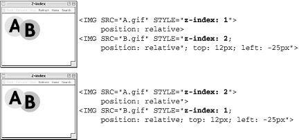
Elements with higher z-index values obscure those with lower values. When z-index is not specified, elements appear from back to front in the order in which they appear in the HTML source.
In Figure 17-6, two ordinary transparent GIFs, A.gif and B.gif, are "stacked" using z-index settings. In the top image, B.gif is given a higher z-index value and thus overlaps A.gif. In the bottom image, the positioning code is the same, but this time, A.gif is given the higher z-index value and comes<> out on top.

The CSS2 specification also includes a new property called visibility, which takes the values visible (the default) or hidden. When an element is hidden, it is not displayed on the page, and the space it occupies is held blank as shown in Figure 17-7 and the following code.
<STYLE TYPE="text/css">
<!--
EM {visibility: hidden;}
-->
</STYLE>
...

<P>This line contains some <EM>emphasized</EM> text, which will be hidden.</P>This is different from display:none (another method for hiding elements) in that display:none removes the element completely from the display and closes up the space that would have been taken up by the element.
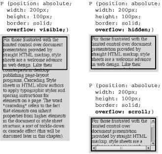
Another new property first proposed in the Positioning Specification is overflow, which provides alternative ways for handling text that does not fit in the box dimensions as specified. It has four possible attributes:
Allows the overflowed content to "flow out" of the fixed box dimensions for the element (Internet Explorer 5 for Windows and other older browsers incorrectly resize the box dimensions to contain the text)
Hides from view the portion of the element that does not fit in the box
Places a scroll bar in the box so the user can scroll down to read its contents
Places a scroll bar only when necessary
Figure 17-8 shows the effects of
different overflow settings on a text
element specified at 200  100 pixels
(visible, hidden, and
scroll, respectively).


Copyright © 2002 O'Reilly & Associates. All rights reserved.