 | Web Design in a Nutshell, 2nd Edition |  |

This section provides a few tricks of the trade for working with tables.
Unfortunately, placing <font> tags around a table will not affect the font of all the text contained within the table. You need to repeat the <font> tag and its attributes around the content in every cell of the table. For complex tables with lots of cells, the repetitive <font> tags can actually add significantly to the size of the HTML file (not to mention the visual clutter).
Cascading style sheets are the proper and much more efficient way to apply style information to the contents of a table. They result in smaller files and make life much easier when you need to make changes to the design.
Using the basic table tags, the browser must wait until the entire contents of a table have downloaded before it can begin rendering the page. Any text and graphics outside the table display quickly while the browser works on the table.
You can use this phenomenon to your advantage by placing elements you want your viewers to see first outside the table (can anybody say "banner ads"?).
Note that careful use of row and column groups can give the browser enough information to display the contents of the table incrementally, before all the data has downloaded.
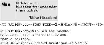
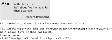
If you want to align the first lines of text by their baselines across a row, you should be able to use valign=baseline; in reality, this setting is too unpredictable across browsers to be used reliably. A trick for achieving the same result is to add to each first line a nonbreaking space ( ) that is set the same size as the largest character. That way, you can set valign=top, and the baselines will all line up.
First look at simple top alignment. As shown in Figure 13-18, the top of the text is aligned, but the baselines are off. By adding a nonbreaking space at the larger text size (in bold), the baselines align neatly, as shown in Figure 13-19.[6]
[6]This and the following tip are courtesy of Builder.com and first appeared in the Builder.com article "Advanced HTML Tips," by Paul Anderson. It is reprinted here with permission of Builder.com and CNET. See http://builder.cnet.com/webbuilding/pages/Authoring/AdvHtml/ for the complete article.


HTML 3.2 specifies that if a cell's colspan implies more columns than have been created up to that point in the table, the browser should create the additional columns. With rowspan, however, the specification states that browsers shouldn't create any extra rows. The existing browsers follow both these rules.
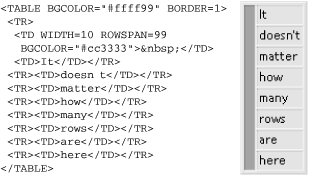
So if you have a cell that spans vertically to the bottom of the table, past rows that might vary in number or are too numerous to easily count, just give it a rowspan that you know is excessively high.
In Figure 13-20, we've set rowspan to 99. Even though there are only seven rows in the actual table, browsers won't generate any extra rows.


Copyright © 2002 O'Reilly & Associates. All rights reserved.