 | Information Architecture for the World Wide Web |  |

Once you've developed high-level blueprints and architectural page mockups, you're ready to collaborate with your graphic designer to create design sketches on paper of major pages in the web site. In the research phase, the design team has begun to develop a sense of the desired graphic identity or look and feel. The technical team has assessed the information technology infrastructure of the organization and the platform limitations of the intended audiences. They understand what's possible with respect to features such as dynamic content management and interactivity. And, of course, the architect has designed the high-level information structure for the site. Design sketches are a great way to pool the collective knowledge of these three teams in a first attempt at interface design for the top level pages of the site. This is a wonderful opportunity for interdisciplinary user interface design.
Using the architectural mockups as a guide, the designer begins sketching pages of the site on sheets of paper. As the designer sketches each page, questions arise that must be discussed. Here is a sample sketching session dialog:
I like what you're doing with the layout of the main page, but I'd like to do something more interesting with the navigation system.
Can we implement the navigation system using pull-down menus? Does that make sense architecturally?
That might work, but it would be difficult to show context in the hierarchy. How about a tear-away table of contents feature? We've had pretty good reactions to that type of approach from users in the past.
We can certainly go with that approach from a purely technical perspective. How would a tear-away table of contents look? Can you sketch it for us? I'd like to do a quick-and-dirty prototype.
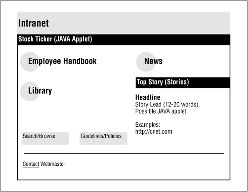
As you can see, the design of these sketches requires the involvement of people from all three teams. It is much cheaper and easier for the group to work with the designer on these rough sketches than to begin with actual HTML page layouts and graphics. These sketches allow rapid iteration and intense collaboration. The final product of a sketching session might look something like that in Figure 8-5.


Copyright © 2002 O'Reilly & Associates. All rights reserved.