 | Information Architecture for the World Wide Web |  |

The collaborative brainstorming process is exciting, chaotic, and fun. However, sooner or later, you must hole up away from the crowd and transform this chaos into order. Blueprints are the architect's tool of choice for performing this transformation.
The very act of shaping ideas into the more formal structure of a blueprint forces you to become realistic and practical. If brainstorming takes you to the top of the mountain, blueprinting brings you back down to reality. Ideas that seemed brilliant on the white board may not pan out when you attempt to organize them in a practical manner. It's easy to throw around concepts such as audience-specific gateways and adaptive information architectures. It's not so easy to define on paper exactly how these concepts will be applied to a specific web site.
During the conceptual design phase, high-level blueprints are most useful for exploring primary organization schemes and approaches. High-level blueprints map out the organization and labeling of major areas, usually beginning with a bird's-eye view from the main page of the web site. This exploration may involve several iterations as you further define the information architecture. High-level blueprints are great for stimulating discussions focused on the organization and management of content as well as the desired access pathways for users. These blueprints can be created by hand, but we prefer to use diagramming software such as Visio or NetObjects Fusion. These products not only help you to quickly layout your architecture blueprints, but can also help with site production and maintenance.

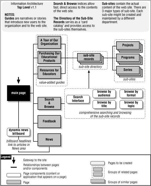
Let's walk through the blueprint in Figure 8-3, as we would when presenting it to clients or colleagues. The building block of this architecture is the sub-site. Within this company, the ownership and management of content is distributed among many individuals in different departments. There are already dozens of small and large web sites, each with its own graphic identity and information architecture. Rather than try to enforce one standard across this collection of sites, this blueprint suggests an umbrella architecture approach that allows for the existence of lots of heterogeneous sub-sites.
Moving up from the sub-sites, we see a directory of sub-site records. This directory serves as a card catalog that provides easy access to the sub-sites. There is a sub-site record for each sub-site. Each record consists of fields such as title, description, keywords, audience, format, and topic that describe the contents of that sub-site.
By creating a standardized record for each sub-site, we are actually creating a database of sub-site records. This database approach enables powerful known-item searching and more exploratory browsing. As you can see from the Search & Browse page, users can search and browse by title, audience, format, and topic.
We also see three value-added guides. These guides take the form of simple narratives or stories that introduce new users to the organization and to the web site. Interwoven throughout the text of these narratives are in-context links to selected sub-sites. They guide users through the site in an interesting and friendly way.
Finally, we see a dynamic news billboard (perhaps implemented through Java or JavaScript) that rotates the display of featured news headlines and announcements. In addition to bringing some action to the main page, this billboard provides yet another way to access important content that might otherwise be buried within a sub-site.
At this point in the discussion of the high-level blueprint, you are sure to have questions. As you can see, the blueprints don't completely speak for themselves. This is why it's ideal to present these blueprints in person, so you can answer questions and explore new ideas.
In addition, your architectural ideas may need selling. Now, we're not suggesting that you buy a polyester suit, but an element of sales is involved. You need to excite your clients and colleagues about your approach and vision for the site. You need to explain the ideas behind your labeling and organization schemes and describe how this model will support growth over time. These challenges are difficult to address without a meeting (or at least a telephone conference call).
However, if a meeting is simply not possible, you can accompany blueprints with descriptive text-based documents that anticipate and answer the most likely questions. You can then follow up with a conference call to answer the questions you didn't anticipate and move the process along.
You should note that these high-level blueprints leave out quite a bit of information. They focus on the major areas of the site, ignoring navigation elements and page-level details. These omissions are by design, not by accident. Shaping the information architecture of a complex web site is a challenging intellectual exercise. You and your colleagues must be able to focus on the big picture issues at hand. For these blueprints, as with the web sites you design, remember the rule of thumb that less is more. Detailed page-level blueprints come later in the process.

Copyright © 2002 O'Reilly & Associates. All rights reserved.