 | Information Architecture for the World Wide Web |  |

With so much variation among users to account for, there can be no single ideal search interface. Although the literature of information retrieval includes many studies of search interface design, many variables preclude the emergence of the right way to design search interfaces. Here are a few of the variables on the table:
The level of searching expertise users have: Are they comfortable with Boolean operators, or do they prefer natural language? Do they need a simple or high-powered interface? What about a help page?
The kind of information the user wants: Do they want just a taste, or are they doing comprehensive research? Should the results be brief, or should they provide extensive detail for each document?
The type of information being searched: Is it made up of structured fields or full text? Is it navigation pages, destination pages, or both? HTML or other formats?
How much information is being searched: Will users be overwhelmed by the number of documents retrieved?
We can, however, provide basic advice that you should consider when designing a search interface.
Before diving into design, think hard about why users are searching your site, and what they want to get out of their search. Are they likely to search for certain types of information, such as specific product descriptions or staff directory entries? If so, support modes of searching that are delineated by content types -- use the same interface to allow users to search the product catalog, or the staff directory, or other content areas (content-delineated indexing involves the creation of search zones, which we'll cover later in this chapter). Are non-English speakers important to your site? Then provide them with search interfaces in their native languages, including language-specific directions, search commands and operators, and help information. Does your site need to satisfy users with different levels of sophistication with online searching? Then consider making available both a basic search interface and an advanced one.
For example, one of our clients, UMI, sells dissertations to an audience that includes researchers, librarians, and others who have been using advanced online information systems for years. We needed an interface that would accommodate this important expert audience who were used to complex Boolean and proximity operators, and who were already very used to the arcane search languages of other commercial information services. However, a simple search interface was also required, because at times users wouldn't need all the firepower of an advanced search interface, especially when conducting simple, known-item searches. Additionally, because it had become available via the Web, a whole new audience of novices would encounter this product for the first time; we assumed that these newbies wouldn't be comfortable with a complex search interface.
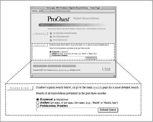
So we created a simple interface that almost anyone could figure out and use right away, shown above in Figure 6-1. A simple search box is ideal for the novice or for a user with a pretty good sense of what he or she is looking for. (We made sure to provide a single search query box; our experience shows that most users don't care for separate boxes, one for each query term, divided by Boolean operators.) Minimal filtering options are provided, including searching for keywords within title and abstract fields, searching within the author field, or searching within the publication number field. These filtering options provide the user with more power by allowing more specific searching. But because the labels Keyword, Author, and Publication Number are fairly self-explanatory, they don't force the user to think too much about these options.
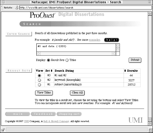
For the advanced users, a more powerful interface was created, shown above in Figure 6-2. This interface supports the following types of searching:
Author, Keyword, Title, Subject, and ten other fields are searchable. A researcher could, for example, find a dissertation related to his or her area of interest by searching the subject field, and learn who that doctoral student's advisor was by reading the abstract. To find other related dissertations, the researcher could then search the Advisor field to learn about other doctoral students who shared the same advisor.
In Figure 6-2, the style "field(search term)" is used (e.g., "keyword(drosophila)"). Because many different query language conventions are supported by traditional online products, users may be used to an established convention. The effort to support these users is made by allowing variant terms. For the field Degree Date, the user can enter either "ddt," "da," "date," "yr," or "year."
More complex queries often require more space than the single line entry box found in the simple search interface in Figure 6-1. The more complex interface supports a much longer query.
Many traditional online information products allow searchers to build sets of results that can be reused. In this example, we've ANDed together the two sets that we've already found, and could in turn combine this result with other sets during the iterative process of searching.
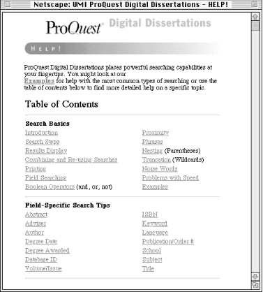
Because this advanced interface supports so many different types of searching, we provided a substantial help page to assist users. For users of common browsers, the help page shown in Figure 6-3 launches in a separate browser window so that users don't need to exit the search interface to get help.
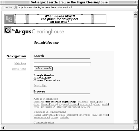
As we mentioned earlier, users typically need to switch back and forth between searching and browsing. In fact, users often don't know if they need to search or browse in the first place. Therefore, these respective systems shouldn't live in isolation from one another.
When we redesigned the Argus Clearinghouse, we integrated these two elements on a single page called Search/Browse, shown in Figure 6-4. This combined interface to searching and browsing makes it clear to the user what he or she can do there. The search/browse approach can be extended by making search and browse options available on the search results page as well, especially on null results pages, when a user might be at a dead end and needs to be gently led back into the process of iterative searching and browsing before frustration sets in.
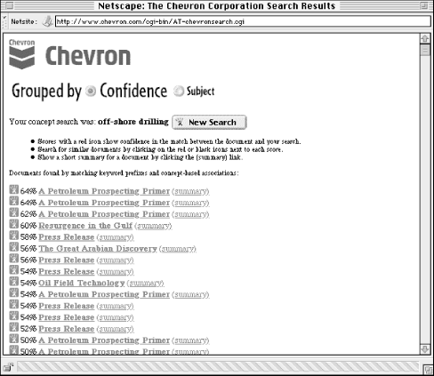
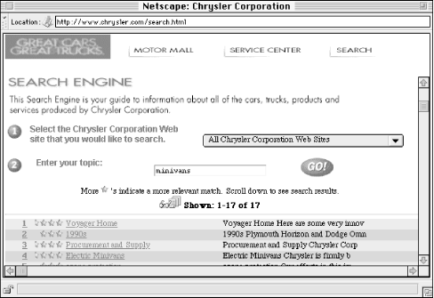
Search engine interfaces, and more importantly, retrieval results, should look and behave like the rest of your site. This advice may seem painfully obvious, but because many search engines are packaged as ready-to-go add-ons to a site, site developers don't bother to customize them.[15] For example, the interface and results produced by the Excite search engine are easy to detect. In fact, they look and work so similarly from site to site that it's easy to forget that they are actually parts of individual sites. Figure 6-5 is a great example of a search interface which hasn't been customized, while Figure 6-6 shows how the search interface can be integrated with the rest of the site's look and feel.
[15]It should be mentioned that some search engines, like AltaVista, don't allow you to modify search and retrieval results pages.
We all pay lip service to the need for user documentation, but with searching, it's really a must. Because so many different variables are involved with searching, there are many opportunities for things to go wrong. On a Help or Documentation page, consider letting the user know the following:
What is being searched. Users often assume that their search query is being run against the full text of every page in your site. Instead your site may support fielded searching (as in the UMI example above), or another type of selective searching (see "Indexing the Right Stuff " later in this chapter). If they're curious, users should be able to find out exactly what they are searching.
How they can formulate search queries. What good is it to build in advanced querying capabilities if the user never knows about them? Show off the power of your search engine with excellent real life examples. In other words, make sure your examples actually work and retrieve relevant documents if the user decides to test them.
User options. Can the user do other neat things such as changing the sorting order of retrieval results? Show them off as well!
What to do if the user can't find the right information. It's important to provide the user with some tricks to handle the following three situations:
a. "I'm getting too much stuff."
b. "I'm not getting anything."
c. "The stuff I'm getting stinks!"
For case (a), you might suggest approaches that narrow the retrieval results. For example, if your system supports the Boolean operator AND, suggest that users combine multiple search terms with an AND between them (ANDing together terms reduces retrieval size).
If they are retrieving zero results, as in case (b), suggest the operator OR, the use of multiple search terms, the use of truncation (which will retrieve a term's variants), and so on.
If they are completely dissatisfied with their searches, case (c), you might suggest that they contact someone who knows the site's content directly for custom assistance. It may be a resource-intensive approach, but it's a far superior last resort to ditching the user without helping them at all.
At this point, you ideally will know something about the sorts of searching capabilities that your site's users will require (not to mention what your budget will allow!). So select a search engine that satisfies those needs as much as possible. For example, if you know that your site's users are already very familiar with a particular way of specifying a query, such as the use of Boolean operators, then the search engine you choose should also support using Boolean operators. Does the size of your site suggest that users will get huge retrieval results? Be sure that your engine supports techniques for whittling down retrieval sizes, such as the AND and NOT operators, or that it supports relevance-ranked results that list the most relevant results at the top. Will users have a problem with finding the right terms to use in their search queries? Consider building in a thesaurus capability (AltaVista's SearchWizard (http://altavista.digital.com/av/lt/help.html) is a common example) or synonym table so that a query for the term car may retrieve documents with the term automobile. As the market for search engines booms, more and more interesting options will be packaged with these tools; let your users' needs be the major factor that guides your choice.
Finding a Search Engine
Okay, you've decided you want to provide a search engine for your web site. Where do you get one?
There are several commercial solutions for web site indexing. Lycos licenses its search engine technology for individual web sites. So does Infoseek.
Excite for Web Servers, or EWS, is a free version of the Excite search engine. You can get it from http://www.excite.com/navigate/. The only requirement is that you include a link back to their web site.
Other freeware search engines include Glimpse (http://glimpse.cs.arizona.edu:1994/) and SWISH (Simple Web Indexing System for Humans) (http://www.eit.com/software/swish/).
You can configure how your search engine displays search results in many ways. There is no right way to do it. How you configure your search engine's results depends on two factors.
The first factor is the degree of structure your content has. What will your search engine be able to display besides just the titles of retrieved documents? Is your site's content sufficiently structured so that the engine can parse out and display such information as an author, a date, an abstract, and so on?
The other factor is what your site's users really want. What sorts of information do they need and expect to be provided as they review search results?
When you are configuring the way your search engine displays results, you should consider these issues:
How much information should be displayed for each retrieved document?
A simple rule is to display less information per result when you anticipate large result sets. This will shorten the length of the results page, making it easier to read. Another rule is to display less information to users who know what they're looking for, and more information to users who aren't sure what they want. (Based on your initial research and assumptions about who will be using your site, you should be able to make at least an intelligent guess as to which types of users your site should support.)
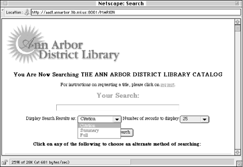
When it's hard to distinguish retrieved documents because of a commonly displayed field (such as the title), show more information to help the user differentiate the results. Consider allowing the user to choose how much information should be displayed. The Ann Arbor District Library, for example, allows users to display retrieval results in three different modes, thus allowing the same tool to serve users with varying information needs; see Figure 6-7.
What information should be displayed for each retrieved document?
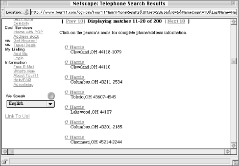
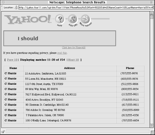
Which fields you show for each document obviously depends on which fields are available in each document (i.e., how structured your content is). What your engine displays also depends on how the content is to be used. Users of phone directories, for example, want phone numbers first and foremost. So it makes sense to show them the information from the phone number field on the results page (see Figures Figure 6-8 and Figure 6-9). Lastly, the amount of space available on a page is limited: you can't have each field displayed, so you should choose carefully, and use the space that is available wisely.
How many retrieved documents should be displayed?
How many documents are displayed depends on the preceding two factors. If your engine displays a lot of information for each retrieved document, you'll want to consider a smaller size for the retrieval set, and vice versa. Additionally, the user's monitor resolution and browser settings will affect the amount of information that can be displayed individually. Your best bet is to provide a variety of settings that the user can opt to select based on his or her own needs, and always let the user know the total number of retrieved documents.
How should retrieved documents be sorted?
Common options for sorting retrieval results include:
in chronological order
alphabetically by title, author, or other fields
by an odd thing called relevance
Certainly, if your site is providing access to press releases or other news-oriented information, sorting by reverse chronological order makes good sense. Chronological order is less common, and can be useful for presenting historical data.
Alphabetical sorts are a good general purpose sorting approach (most users are familiar with the order of the alphabet!). Alphabetical sorting works best if initial articles such as a and the are omitted from the sort order (certain search engines provide this option). Users will find this helpful as they are more likely to look for The Naked Bungee Jumping Guide under N rather than T.
Relevance is an interesting concept; when a search engine retrieves 2,000 documents, isn't it great to have them sorted with the most relevant at the top, and the least relevant at the bottom? Well, certainly, if this actually would work. Relevance ranking algorithms (there are many flavors) are typically determined by some combination of the following: how many of the query's terms occur in the retrieved document; how many times those terms occur in that document; how close to each other those terms occur (e.g., are they adjacent, in the same sentence, or in the same paragraph?); and where the terms occur (e.g., a document with the query term in its title is more likely to be relevant than a document with the query term in its body).
It's confusing for certain if you're responsible for configuring the search engine, and probably more so for users. Different relevance ranking algorithms make sense for different types of content, but with most search engines, the content you're searching is apples and oranges. So, for example, a retrieval might rank Document A higher than Document B, but Document B is definitely more relevant. Why? Because Document B is a bibliographic citation to a really relevant work, but Document A is a long document that just happens to contain many instances of the terms in the search query.
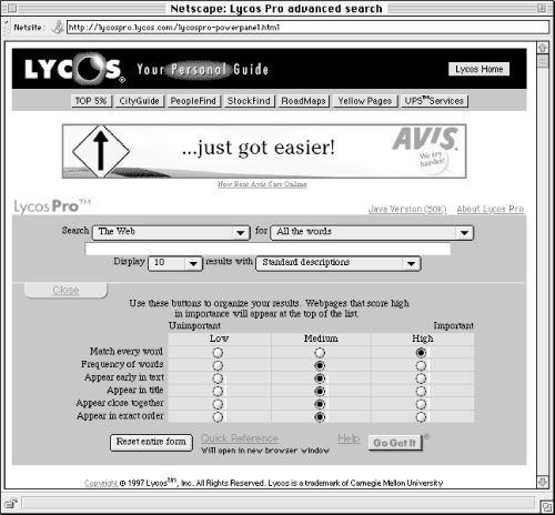
Our advice is to use relevance with caution and consider doing something that few search tools do: let the user know how your engine is calculating relevance. Or, as with the Java implementation of Lycos Pro (Figure 6-10), let the user control the relevance algorithm.
Many search engines use counterintuitive sorting approaches by default, including when the file was last updated or indexed (a variant of chronological ordering), or what physical directory the file resides in. Avoid these defaults; they are obtuse and will confuse the user. Whatever approach you use, make the ranking order clear to users by making the sort field a prominent part of each result. Consider shifting the decision on what sort is most useful by giving the user the option of selecting their own sorting option.
Let's say you're interested in knowing what the New Jersey sales tax is. Maybe you're driving through on a trip, and want to know if you should stop at an outlet mall or wait until you get to Pennsylvania, where you know the sales tax. So you go to the State of New Jersey web site and search on sales tax (see Figure 6-11).
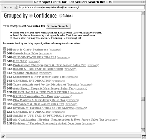
The 20 results are scored at either 84% or 82% relevant. Why does each document receive only one of two scores? Are the documents in each group so similar to each other? And what the heck makes a document 2% more relevant than another? Let's compare two retrieved documents, one which received an 84% relevancy score (Figure 6-12), the other 82% (Figure 6-13).
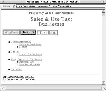
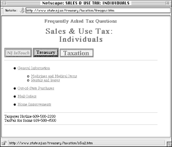
As you can see, these documents are almost exactly the same. Both have very similar titles, and neither uses hidden <META> tags to prejudice the ranking algorithm. Finally, both documents mean essentially the same thing, differing only in that one deals with businesses and the other with individual consumers. The only apparent difference? While sales and tax appear within <TITLE> and <H1> tags of both documents, they appear in the body of only the first document, not in the second. The search engine probably adds 2% to the score of the first document for this reason. Probably, because, as the algorithm isn't explained, we don't know for sure if this is the correct explanation.
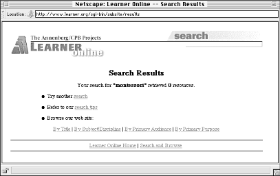
When a user executes a search, he or she expects results. Usually, a query will retrieve at least one document, so the user's expectation is fulfilled. But sometimes a search retrieves zero results. Let the user know by creating a different results page specially for these cases. This page should make it painfully clear that nothing was retrieved, and give an explanation as to why, tips for improving retrieval results, and links to both the Help area and to a new search interface so the user can try again (see Figure 6-14).
You might also consider including a few easy-to-implement but very useful things in your engine's search results:
Repeat back the original search query prominently on the results page.
As users browse through search results, they may forget what they searched for in the first place. Remind them. Also include the query in the page's title; this will make it easier for users to find it in their browser's history lists.
Let the user know how many documents in total were retrieved.
Users want to know how many documents have been retrieved before they begin reviewing the results. Let them know; if the number is too large, they should have the option to refine their search.
Let the user know where he or she is in the current retrieval set.
It's helpful to let users know that they're viewing documents 31- 40 of the 83 total that they've retrieved.
Always make it easy for the user to revise a search or start a new one.
Give them these options on every results page, and display the current search query on the Revise Search page so they can modify it without reentering it.

Copyright © 2002 O'Reilly & Associates. All rights reserved.