 | Information Architecture for the World Wide Web |  |

This chapter emphasizes the need for labels to be familiar for users, and also that consistency and representation are the foundations for building that familiarity. Now that we have belabored that point, we'll counter it with another: labeling systems should not necessarily be representational.
What? Would you make up your mind already?
Well, let's put it this way: non-representational labeling is not something that we'd recommend using regularly. In fact, it's difficult to determine when it should be applied. Following are two examples where we think it succeeds.
Head-scratching is usually a Bad Thing. It means that some aspect of a site has confused a user and is in the way of achieving the site's main goal, namely, conveying a message. But, like everything else, even cognitive confusion has a good side: Mystery.
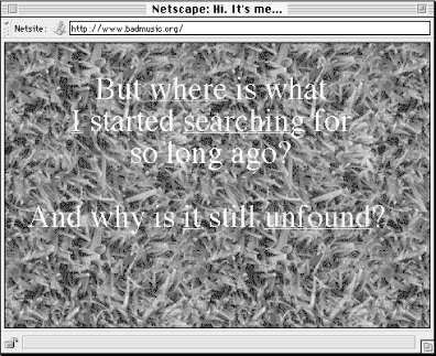
Consider the main page shown in Figure 5-11. What the heck is going on here? If you come to this site, you may already have a little context, knowing in advance that it's a personal site. If not, you might figure this out fairly quickly, as this text uses the first person and seems to describe a personal quest. Beyond that, this page tells nothing about what you'll find in this site.

But you might want to know more. The radical aspect of this page involves its use of two brief sentences and five highly generic terms as labels to draw the user into a very personal experience. The labels are almost completely non-representational, and even in context they make you wonder and want to learn more.
If these link labels were accompanied by more information, such as scope notes, the effect would probably be lost:
|
Label |
Scope Note |
|---|---|
|
where |
Descriptions of various places where the author has lived. |
|
I |
Basic information about the author. |
|
searching |
What the author has found while searching for meaning in his life. |
|
it |
Friends and meaning that the author found. |
|
unfound |
What the future may have in store. |
There's no mystery if the site provided (gave away, really) this information on the main page. Without a little mystery, this site just wouldn't work.
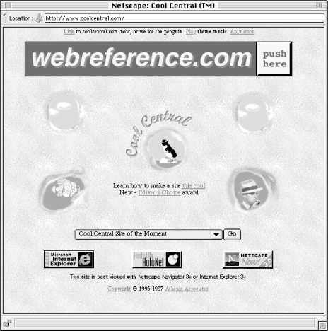
The same principle of mystery can apply with iconic labels. The site shown in Figure 5-12, Cool Central, showcases a different cool web site every few moments. It is geared toward web site developers and is a fun counterpart to the sponsor's other more informational site, webreference.com. The main page is distinguished by five holes, with miscellaneous pictures and activities (e.g., moving clouds, swimming fish) visible in each.

Each of the five holes links to a section of the site:
|
Iconic Label Position |
Leads To |
|---|---|
|
sky and floating clouds (top left) |
About Cool Central |
|
swimming fish |
Nick's Picks |
|
penguin |
Cool Central Site of the [Moment, Hour, Day, Week] |
|
sky and floating clouds (top right) |
Advertising Information |
|
smoking detective |
Nick Click, Private Eye |
Of course, none makes any sense at all, save for the detective icon, which leads to a private eye-themed area. Of course, you'll want to click on each just to learn what they lead to. Goofy, silly, and weird, but in a non-serious site that exists solely for the purpose of having fun, it works.

Copyright © 2002 O'Reilly & Associates. All rights reserved.