 | Information Architecture for the World Wide Web |  |

With all navigation systems, before we can plot our course, we must locate our position. Whether we're visiting Yellowstone National Park or the Mall of America, the You Are Here mark on fixed-location maps is a familiar and valuable tool. Without that landmark, we must struggle to triangulate our current position using less dependable features such as street signs or nearby stores. The You Are Here indicator can make all the difference between knowing where you stand and feeling completely lost.
In designing complex web sites, it is particularly important to provide context within the greater whole. Many contextual clues in the physical world do not exist on the Web. There are no natural landmarks and no north and south. Unlike physical travel, hypertextual navigation allows users to be transported right into the middle of a large unfamiliar web site. Links from remote web pages and search engine result pages allow users to completely bypass the front door or main page of the web site. To further complicate matters, people often print web pages to read later or to pass along to a colleague, resulting in even more loss of context.
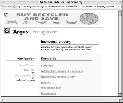
You should always follow a few rules of thumb to ensure that your sites provide contextual clues. First, all pages should include the organization's name. This might be done as part of the title or header of the page. As a user moves through the levels of a site, it should be clear that they are still within that site. Carrying the graphic identity throughout the site supports such context and consistency. In addition, if a user bypasses the front door and directly accesses a subsidiary page of the site, it should be clear which site he or she is on.
Second, the navigation system should present the structure of the information hierarchy in a clear and consistent manner and indicate the location within that hierarchy. See Figure 4-2 for an example.


Copyright © 2002 O'Reilly & Associates. All rights reserved.