 | Cascading Style Sheets: The Definitive Guide |  |

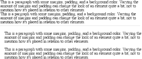
The most basic things you can add to an element are margins. These create extra blank space around an element. "Blank space" generally refers to the area in which other elements cannot also exist and in which the parent element's background is visible. For example, look at Figure 7-5, which shows the difference between two paragraphs without any margins, and the same two paragraphs with some margins.
The simplest way to set a margin is by using the property margin.
margin
- Values
[ <length> | <percentage> | auto ]{1,4}
- Initial value
not defined
- Inherited
no
- Applies to
all elements
WARNING
Percentage values refer to width of the parent element.
Suppose we wish to set a quarter-inch margin on H1 elements, as illustrated in Figure 7-6. (A background color has been added in order to be able to see the edges of the content area.) For example:
H1 {margin: 0.25in; background-color: silver;}
This sets a quarter-inch of blank space on each side of an H1 element. In Figure 7-6, this is represented using dashed lines which are included for illustrative purposes. These lines would not actually appear in a web browser.
margin can accept any length measure, whether in pixels, inches, millimeters, or ems. However, the default value for margin is effectively 0 (zero), which means that if you don't declare a value, then by default, there won't be a margin.
TIP
In practice, browsers come with pre-assigned styles for many elements, and margins are no exception. For example, in CSS-enabled browsers, the "blank line" above and below each paragraph element is generated using margins. Therefore, if you don't declare margins for the P element, the browser may apply some margins on its own -- which is to say that just because you don't declare margins for an element doesn't mean that there won't be any.
You can also declare a margin to be auto. For now, assume that auto will get you an automatically calculated value, which is usually, but not quite always, zero. (Fortunately, the circumstances under which auto becomes something other than zero are very well-defined, and are discussed in detail in the next chapter.)
Finally, it's possible to set a percentage value for margin. The details of this type of value will be discussed in a later section.
As stated before, any length value can be used in setting the margins of an element. If we want a 10-pixel whitespace around paragraph elements, that's simple enough. The following markup creates a normal paragraph and one that has a ten-pixel margin applied to it, shown in Figure 7-7:
P {background-color: silver;}
P.one {margin: 10px;}
(Again, the background color helps show the content area, and the dashed lines are for illustrative purposes only.) As Figure 7-7 demonstrates, 10 pixels of space are added to each side of the content area. This is somewhat similar to using the HSPACE and VSPACE attributes in HTML. In fact, you can use margin to set extra space around an image. Let's say you want 1 em of space surrounding all images:
IMG {margin: 1em;}That's all it takes.
There may be times where you want a different amount of space on each side of an element. That's simple as well. If we want all H1 elements to have a top margin of 10 pixels, a right margin of 20 pixels, a bottom margin of 15 pixels, and a left margin of 5 pixels, here's all we need:
H1 {margin: 10px 20px 15px 5px; background-color: silver;}As Figure 7-8 reveals, we have what we wanted. The order of the values is obviously important, and follows this pattern:
margin: top right bottom left
A good way to remember this pattern is to keep in mind that the four values go clockwise around the element, starting from the top. The values are always applied in this order, so in order to get the effect you want, you have to arrange the values correctly.
TIP
An easy way to remember the order in which sides have to be declared, other than thinking of it as being clockwise from the top, is to keep in mind that getting the sides in the correct order helps you avoid "trouble" -- that is, TRBL, for "Top Right Bottom Left."
It's also possible to mix up the types of length value you use. You aren't restricted to using a single length type in a given rule, as shown here:
H2 {margin: 14px 5em 0.1in 3ex;} /* value variety! */Figure 7-9 shows us, with a little extra annotation, the results of this declaration.

As stated earlier, it's possible to set percentage values for the margins of an element. Percentages are computed in relation to the width of the parent element, so they change if the parent element's width changes in some way. For example, assume the following, shown in Figure 7-10:
P {margin: 10%;}

<DIV STYLE="width: 200px;">
<P>This paragraph is contained within a DIV which has a width of 200 pixels,
so its margin will be 10% of the width of the paragraph's parent (the DIV).
Given the declared width of 200 pixels, the margin will be 20 pixels on
all sides.</P>
</DIV>
<DIV STYLE="width: 100px;">
<P>This paragraph is contained within a DIV with a width of 100 pixels,
so its margin will still be 10% of the width of the paragraph's parent.
There will, therefore, be half as much margin on this paragraph as that
on the first paragraph.</P></DIV>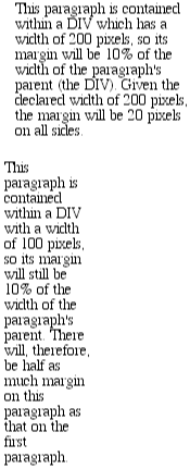
While this is interesting enough, consider the case of elements without a declared width, whose overall width (including margins) is therefore dependent on the width of the parent element.
P {margin: 10%}Figure 7-11 shows how the margin of a paragraph changes as it's viewed in browsers windows of two different sizes.
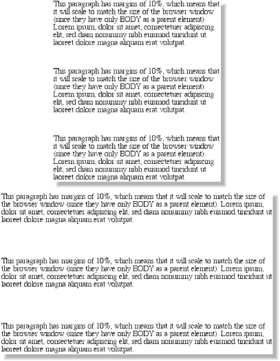
As you can imagine, this leads to the possibility of "fluid" pages, where the margins and padding of elements enlarge or reduce to match the actual size of the display canvas. In theory, as the user changes the width of a browser window, the margins and padding will expand or shrink dynamically -- but not every browser supports this sort of behavior. Still, using percentages for margin and padding may be the best way to set styles that will hold up in more than one media; for example, documents that will look good on a monitor as well as a printout.
It's also possible to mix percentages with length values. Thus, to set H1 elements to have top and bottom margins of one-half em and side margins that are 10% of the width of the browser window, you can declare the following, shown in Figure 7-12:
H1 {margin: 0.5em 10% 0.5em 10%;}
Here, although the top and bottom margins will stay constant in any situation, the side margins will change based on the width of the browser window. This of course assumes that all H1 elements are the child of the BODY element and that BODY is as wide as the browser window. More properly stated, the side margins of H1 elements will be 10% of the width of the H1's parent element.
Let's revisit that example for a moment:
H1 {margin: 0.5em 10% 0.5em 10%;}Seems a little redundant, doesn't it? After all, you have to type in the same pair of values twice. Fortunately, CSS offers an easy way to avoid this.
Sometimes, the values you're entering for margin get a little repetitive:
P {margin: 0.25em 1em 0.25em 1em;}You don't have to keep typing in pairs of numbers like this, though. Instead of the preceding markup, try this:
P {margin: 0.25em 1em;}These two values are enough to take the place of four. But how?
CSS defines a few steps to accommodate fewer than four values for margin:
If the value for left is missing, use the value provided for right.
If the value for bottom is missing, use the value provided for top.
If the value for right is missing, use the value provided for top.
If you prefer a more visual approach, take a look at the diagram shown in Figure 7-13.

In other words, if there are three values given for margin , the fourth (left) is copied from the second (right). If there are two values given, the fourth is copied from the second, and the third (bottom ) from the first (top ). Finally, if there is only one value given, then it's copied to all the others.
This simple mechanism allows authors to supply only as many values as necessary, as shown here:
H1 {margin: 0.25em 0 0.5em;} /* same as '0.25em 0 0.5em 0' */
H2 {margin: 0.15em 0.2em;}  /* same as '0.15em 0.2em 0.15em 0.2em' */
P {margin: 0.5em 10px;}  /* same as '0.5em 10px 0.5em 10px' */
P.close {margin: 0.1em;}  /* same as '0.1em 0.1em 0.1em 0.1em' */
The only drawback to this ability is a small one, but you're bound to run into it eventually. Suppose you want to set the top and left margins for H1 elements to be 10 pixels, and the bottom and right margins to be 20 pixels. In that case, you have to write the following:
H1 {margin: 10px 20px 20px 10px;} /* can't be any shorter */Unfortunately, there is no way to cut down on the number of values needed in such a circumstance.
Let's take another example: one where we want all of the margins to be auto -- except for the left margin, which should be 3em :
H2 {margin: auto auto auto 3em;}Again, we got the effect we wanted. The problem is all that typing of auto gets a little tedious. After all, all we want to do is affect the margin on one side of the element as shown in Figure 7-14, which leads us to the next topic.
Fortunately, there's a way to assign a value to the margin on a single side of an element. Let's say we only want to set the left margin of H2 elements to be 3em. Instead of all the typing required with margin , we could take this approach:
H2 {margin-left: 3em;}margin-left is one of four properties devoted to setting the margins on each of the four sides of an element box. Their names should come as little surprise.
Using any one of these properties allows you to set a margin on that side only, without directly affecting any of the other margins.
It's possible to use more than one of these single-side properties in a single rule; for example:
H2 {margin-left: 3em; margin-bottom: 2em; margin-right: 0; margin-top: 0;}As we see in Figure 7-15, the margins were set as we wanted them.

However, in this case, it might have been easier to use margin after all:
H2 {margin: 0 0 2em 3em;}The results will be exactly the same as those we saw before, only with a little bit less typing. In general, once you're trying to set margins for more than one side, it's almost easier to simply use margin. From the standpoint of your document's display, however, it doesn't really matter which approach you use, so feel free to choose whichever is easier for you.
There is one interesting aspect of applying margins to block-level elements: the collapsing of adjacent vertical margins. This comes into play when an element with margins immediately follows another such element in the document's layout.
A perfect example is an unordered list, in which the list items follow one another. Assume that the following is declared for a list that contains five list items:
LI {margin-top: 10px; margin-bottom: 15px;}Thus, each list item has a 10-pixel top margin and a 15-pixel bottom margin. However, when the list is rendered, the distance between adjacent list items is 15 pixels, not 25. This is because along the vertical axis, adjacent margins are said to be collapsed. In other words, the smaller of the two margins is eliminated in favor of the larger. Figure 7-16 shows the difference between collapsed and uncollapsed margins.

Correctly implemented user agents will collapse the vertically adjacent margins, as shown in the first list in Figure 7-16, where there are 15-pixel spaces between each list item. The second list shows what would happen if the user agent didn't collapse margins, resulting in 25-pixel spaces between list items.
Another word to use, if you don't like "collapse," is "overlap." Although the margins are not really overlapping, you can visualize what's happening using the following analogy. Imagine that each element, such as a paragraph, is a small piece of paper with the content of the element written on it. Around each piece of paper is some amount of clear plastic; this plastic represents the margins. The first piece of paper (say an H1 piece) is laid down on the canvas (browser window). The second (a paragraph) is laid below it and then slid up until the edge of one of the piece's plastic touches the edge of the other's content. If the first piece of paper has half an inch of plastic along its bottom edge, and the second has a third of an inch along its top, then when they slide together, the first piece's plastic will touch the top edge of the second piece of paper. The two are now done being placed on the canvas, and the plastic attached to the pieces is overlapping.
This is also occurs where multiple margins meet, such as at the end of a list. Adding to the earlier example, let us assume the following rules:
UL {margin-bottom: 10px;}
LI {margin-top: 10px; margin-bottom: 20px;}
H1 {margin-top: 28px;}
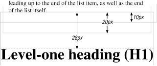
Therefore, the last item in the list has a bottom margin of 20 pixels, the bottom margin of the UL is 10 pixels, and the top margin of a succeeding H1 is 28 pixels. Given all this, once the margins have been collapsed (or, if you prefer, overlapped), the distance between the end of the LI and the beginning of the H1 is 28 pixels, as shown in Figure 7-17.
This collapsing behavior only applies to margins. Padding and borders, where they exist, are never collapsed by anything.
There's another side to margins: the negative side. That's right, it's possible to set negative values for margins. This will have some interesting effects, assuming that a user agent supports negative margins at all.
TIP
User agents are not, according to the CSS1 specification, required to fully support negative margins, using the phrase, "A negative value is allowed, but there may be implementation-specific limits." In the world of web browsers, though Navigator 4.x, Explorer 4.x/5.x, and Opera 3.x do permit negative margins:
Negative margins have an impact on vertical formatting, affecting how margins are collapsed. If there are negative vertical margins, then the browser should take the absolute maximum of the negative margins and subtract that from the maximum of any positive margins.
In the case where there are only two margins to be collapsed, one positive and the other negative, the situation is handled in a fairly simple manner. The absolute value of the negative margin is subtracted from the positive margin -- or, to put it another way, the negative is added to the positive -- and the resulting value is the distance between the elements.
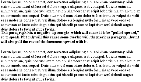
To see what this means, let's start with a paragraph that has a negative top margin and no margins on its other sides -- this will keep the example simple. In addition, we'll make the paragraph bold, so that it's easier to distinguish from its neighbors:
<P STYLE="margin: -1.75em 0 0 0; font-weight: bold;">
This paragraph has a negative top margin...
</P>
We can see in Figure 7-18 that the paragraph has been pulled up so far that it's practically overlapping the end of the previous paragraph. This is the expected effect.
In a like manner, setting a negative value on the other sides will pull them beyond their normal limits:
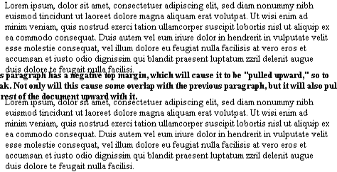
<P STYLE="margin: -2em; font-weight: bold;">...
As Figure 7-19 makes abundantly clear, the paragraph has spilled beyond the edges of the browser window and has not only pulled up far enough to overlap the end of the previous paragraph, but has also pulled the following paragraph up to overlap its last line.
Negative percentages are also permitted. These will behave like any negative length value, with the obvious difference that the amount of negativity will depend on the width of the parent element. Thus:
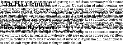
P {margin: -10%;}Figure 7-20 illustrates the consequences of such a rule, where the amount by which paragraphs overlap each other and spill beyond the browser window is entirely dependent on the width of the window itself -- and the wider the window, the worse the situation becomes.
Using negative margins with block-level elements such as these can quite obviously be dangerous and is rarely worth the trouble -- but it can also be rewarding. It takes a good deal of practice, and many mistakes, to learn to tell the difference between the two.
So far, we've only talked about how margins apply to block-level elements like paragraphs and headers. Margins can also be applied to inline elements, although the effects are a little different.
Let's say that you want to set top and bottom margins on boldfaced text. You declare:
B {margin-top: 25px; margin-bottom: 50px;}This is allowed in the specification, but it will have absolutely no effect on the line height, and since margins are effectively transparent, this will have no visual effect whatsoever -- as you can see for yourself in Figure 7-21.
This happens because margins on inline elements don't change the line height of an element. (In fact, the only properties that can change the distance between lines containing only text are line-height, font-size, and vertical-align.)
However, all of this is true only for the top and bottom sides of inline elements; the left and right sides are a different story altogether. We'll start by considering the simple case of a small inline element within a single line, as depicted in Figure 7-22.
Here, if we set values for the left or right margin, they will be visible, as Figure 7-23 makes obvious:
B {margin-left: 10px; background: silver;}Note the extra space between the end of the word just before the inline element, and the edge of the inline element's background. This can end up on both ends of the inline if we wish:
B {margin: 10px; background: silver;}As expected, Figure 7-24 shows a little extra space on the right and left sides of the inline element, and no extra space above or below it.
This all seems simple enough, but when the boldfaced text stretches across multiple lines, the situation becomes a little odd. First, realize that the margins set for inline elements are not applied at the point where line-breaking occurs. This line-breaking happens in the course of wrapping text so that it fits inside the browser's window, for example, or inside a parent element. The only effect margins have on line-breaking is that, by causing extra space to appear within the line, they can move content over. This may cause a line to break at a different spot than it ordinarily would have.
Turn to Figure 7-25 to see what happens when an inline element with a margin is displayed across multiple lines:
B {margin: 10px; background: silver;}The left margin is applied to the beginning of the element, and the right margin to the end of it. Margins are not applied to the right and left side of each line. Also, you can see that if not for the margins, the line may have broken after "text" instead of after "boldfaced." This is the only real way in which margins affect line-breaking.
To understand why, let's go back to the paper-and-plastic analogy employed in the previous section. Think of an inline element as a strip of paper with marginal plastic surrounding it. Displaying the inline element on multiple lines is like cutting up the strip into smaller strips. However, no extra plastic is added to each smaller strip. The only plastic used is that which was on the strip to begin with, so it only appears at the beginning and end of the inline element.
As useful as margins are, a number of problems can arise with their use -- enough, in fact, that they warrant their own section, instead of just a small warning box.
The first is that Navigator 4.x generally adds margin rules to its built-in margins, instead of replacing the built-in values. For example, let's say you want to eliminate the space between H1 elements and paragraphs. Here's the simplest case for doing so:
H1 {margin-bottom: 0;}
P {margin-top: 0;}
This is, after all, one correct way to eliminate the space between succeeding elements. Navigator 4.x, however, will display the elements with the usual blank line between them, as you can see in Figure 7-26. This is because it's adding the zero values to its own default margins.

If you want to overcome this space, you can always use negative margins. Here's one possible declaration:
H1 {margin-bottom: 0;}
P {margin-top: -1em;}
The problem with this solution arises when the document is viewed in Internet Explorer, which will display what's shown in Figure 7-27. The overlapping text is not a mistake on Explorer's part -- it's doing exactly as you specified. Basically, there isn't an easy way to circumvent this problem, although two possible approaches are detailed in Chapter 11, "CSS in Action".

It gets worse, unfortunately. If you apply margins to inline elements, as was discussed previously, you'll get results from Navigator 4.x like those shown in Figure 7-28.
The style used to generate Figure 7-28 was as follows:
STRONG {margin-left: 10px;}Instead of adding ten pixels of blank space to the beginning of the STRONG element, Navigator assumes that the margin refers to the left edge of the browser window, and places the STRONG element accordingly This is utterly, completely wrong. (There are those who speculate that Navigator turns the inline element into a block-level element, but its placement implies that things may be otherwise. It's difficult to be sure.) Unfortunately, the fact that this happens means that the use of margins on inline elements is a risky proposition, and not one to be undertaken lightly.

Copyright © 2002 O'Reilly & Associates. All rights reserved.